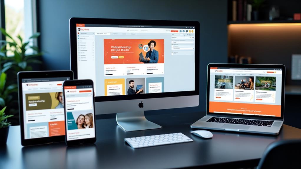
Creating a Responsive Design With Your CMS
When aiming to create a responsive design with your CMS, choosing the right platform is essential. Opt for a CMS that provides mobile-optimized templates and user-friendly tools, such as drag-and-drop functionalities. Incorporate fluid grids, flexible images, and media queries to ensure your site adapts seamlessly to different screen sizes, enhancing the user experience.
However, maintaining functionality and visual appeal across all devices requires more than just initial setup. Follow these fundamental steps and best practices to streamline your content management process, improve user retention, and boost search engine rankings:
- Choose the Right CMS: Ensure your CMS supports responsive design out-of-the-box with pre-built mobile-optimized templates.
- Use Fluid Grids: Implement fluid grid layouts to allow your design to scale proportionally.
- Optimize Images: Use flexible images that adjust based on the screen size and resolution.
- Apply Media Queries: Utilize media queries to tailor your site's design for different devices.
- Test Across Devices: Regularly test your website on various devices to ensure consistent performance and appearance.
- SEO Considerations: Implement SEO best practices to improve search engine visibility and rankings on both desktop and mobile.
By following these steps, you can ensure your responsive design not only looks good but also functions optimally across all devices, thereby enhancing user engagement and satisfaction.
Understanding Responsive Web Design
Responsive web design (RWD) revolutionizes how we interact with websites on various devices. With RWD, websites dynamically adjust their layout and content based on the screen size and resolution of the device being used, ensuring an optimal user experience on smartphones, tablets, and desktops.
To achieve responsive design, developers employ fluid grids, flexible images, and media queries. Fluid grids enable elements to resize proportionally rather than using fixed dimensions. Flexible images adapt to different screen sizes without losing quality or causing layout issues. Media queries allow the website to apply specific styles based on the device's characteristics, ensuring seamless navigation and readability.
Imagine not having to pinch-zoom or scroll excessively to read an article on your phone. That's the advantage of responsive design. Studies indicate that nearly 90% of users abandon websites that aren't mobile-friendly. By implementing RWD, you can retain visitors and reduce bounce rates.
Additionally, responsive design positively impacts search engine rankings. Google prioritizes mobile-friendly websites, making them more visible in search results. Implementing RWD also saves time and resources, as you won't need separate sites for different devices, streamlining your web development process.
Importance of Responsive Design
In today's digital landscape, having a mobile-optimized site is essential due to the significant number of users accessing the web via smartphones and tablets. Responsive design ensures that your site performs efficiently across all devices. With 63% of mobile users accessing Google, a mobile-optimized site significantly enhances your search rankings and visibility.
Without responsive design, poor mobile experiences can lead to up to 90% of users abandoning your website. This underscores the importance of providing a high-quality mobile experience to retain visitors. High bounce rates, which can reach up to 40% on smartphones, can be mitigated with responsive design, emphasizing its importance for user retention.
Moreover, approximately 57% of consumers are unlikely to recommend poorly designed mobile sites. This highlights the impact of responsive design on brand reputation and customer advocacy. Investing in responsive design also guarantees compatibility with a wide range of devices, ensuring your website remains effective with evolving technology and user preferences.
Here's a quick summary of the key points:
| Fact | Impact |
|---|---|
| 63% of mobile users access Google | Improves search rankings |
| 90% abandon non-mobile-friendly sites | Essential for user retention |
| High bounce rates (up to 40%) | Reduces bounce rates |
| 57% won't recommend poorly designed sites | Affects brand reputation |
| Compatibility with diverse devices | Future-proofs website |
Responsive design is not just a trend; it's a necessity for maintaining a successful online presence.
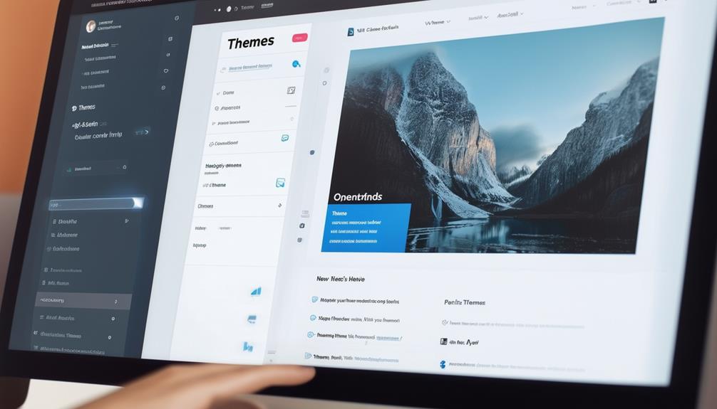
Selecting a CMS for Responsive Design
Choosing the right CMS is crucial for creating and maintaining a responsive website. Platforms like WordPress, Wix, and Squarespace offer pre-built, mobile-optimized templates that simplify the design process, enabling you to achieve a responsive layout with minimal coding knowledge.
When selecting a CMS, prioritize those with user-friendly tools such as drag-and-drop functionalities. These features empower users with limited technical expertise to build responsive websites effortlessly. Additionally, opt for CMS options that support flexible layouts and customizable media and content. This adaptability ensures your website looks great on all devices, enhancing the overall mobile viewing experience.
It's also important to choose a CMS that integrates well with marketing tools. Such integration helps maintain a cohesive user experience across various devices and platforms. Lastly, consider the availability of comprehensive training resources and support for the CMS. Access to these resources can significantly aid in implementing and maintaining your responsive design effectively, ensuring long-term success for your website.
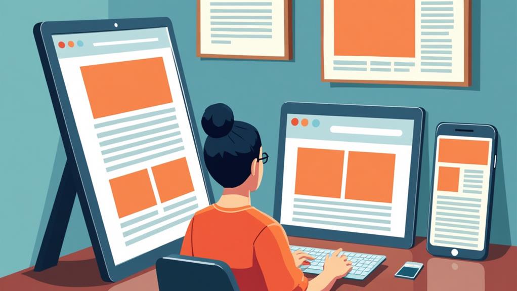
Flexible Layout Techniques
When working on flexible layout techniques, use relative sizing such as percentages or viewport units to ensure your content adapts seamlessly across different screen sizes. Implement breakpoints using media queries to customize your layout for specific devices, enhancing user experience. Optimize content alignment by avoiding fixed pixel widths, and frequently test your layouts by resizing your browser window to identify any issues early.
Utilizing Relative Sizing
Relative sizing revolutionizes the creation of flexible and responsive web layouts. By utilizing units such as percentages, viewport width (VW), and viewport height (VH), you ensure that your elements resize dynamically with changes in the browser window. This technique fosters a fluid and adaptable layout, significantly enhancing the overall responsiveness of your website.
Employing relative sizing improves both aesthetics and usability by maintaining content proportionality across various device sizes. This approach helps you avoid common issues associated with fixed sizing, such as content overflow or misalignment on smaller screens, which can detract from the user experience. By implementing relative sizing, your design remains consistent and visually appealing, irrespective of the device.
Moreover, relative sizing contributes to faster loading times. Browsers can render elements more efficiently when they adjust based on screen dimensions, resulting in better site performance. Testing your designs with relative sizing is straightforward—simply resize your browser window to observe real-time adjustments and ensure that your layout responds appropriately to different screen sizes.
Implementing Breakpoints Effectively
Implementing breakpoints effectively is crucial for creating a responsive and user-friendly website. Breakpoints, also known as media queries, allow you to tailor your layout for different devices, including smartphones, tablets, and desktops. By defining specific width ranges, you can ensure your design adapts fluidly to varying screen sizes, enhancing the overall user experience.
Begin by identifying common screen sizes: 320px for mobile phones, 768px for tablets, and 1024px for desktops. Use CSS media queries to apply different styles based on these dimensions. For instance, you can adjust font sizes, margins, and other design elements to improve readability and usability on mobile devices.
Always test your breakpoints by resizing your browser window or using developer tools. This practice helps you observe how your layout adapts in real-time, ensuring a seamless experience across different devices.
To create more flexible layouts, use relative sizing units like percentages or viewport widths within your breakpoints. This approach ensures your design remains fluid, automatically adjusting to changes in screen size, which is vital for a responsive web presence.
Optimizing Content Alignment
Achieving optimal content alignment is crucial for creating layouts that adapt seamlessly across various screen sizes. In responsive design, flexible layouts dynamically adjust the arrangement of content, ensuring readability and accessibility on all devices. Here are several techniques to optimize content alignment using flexible layout strategies:
- Leverage Grid Frameworks: Most Content Management Systems (CMS) provide built-in grid frameworks designed to create fluid layouts. These frameworks enable content to adjust automatically based on device orientation and screen size, ensuring an adaptive and consistent user experience.
- Use Relative Sizing Units: Opt for relative units like percentages or viewport widths instead of fixed pixel sizes. This practice enhances flexibility, allowing elements to resize proportionally and maintain a uniform layout across different devices.
- Avoid Complex Tables in WYSIWYG Editors: Complex tables can compromise responsiveness. Use designated content types within your CMS to maintain proper formatting and alignment, ensuring content remains accessible on all screen sizes.
- Regularly Test Your Layouts: Frequently resize your browser window to identify areas that require adjustments. This proactive approach helps you spot and fix issues early, guaranteeing a smooth user experience on smaller screens.
Image Sizing Best Practices

When designing a responsive website, ensuring your images are sized correctly is fundamental for delivering a seamless user experience. Adhering to image sizing best practices can significantly impact how your site performs and looks across diverse devices.
First, always follow the specified image size requirements. For desktop displays, use images that are around 1200 pixels wide. For mobile devices, aim for 400 pixels. This ensures that your images maintain their quality and help your pages load faster.
Testing is key. Adjust your browser width to see how images scale and maintain their aspect ratios. This step helps you identify and resolve any issues before they affect user experience.
For graphics, consider using scalable vector graphics (SVGs). SVGs offer infinite scalability without losing quality, making them perfect for responsive design. Additionally, they improve loading times, contributing to a smoother user experience.
Consistent image quality across devices is critical for a cohesive brand identity. High-quality images reduce bounce rates by keeping visitors engaged and showcasing your content in the best light possible. By following these image sizing best practices, you'll ensure a polished, professional look for your site.
Enhancing User Experience
After confirming your images are perfectly sized, focus on enhancing the overall user experience on your site. A responsive design is essential for making your content accessible and visually appealing across various devices. Consider these key strategies:
- Prioritize Mobile Content: With 57% of consumers unlikely to recommend poorly designed mobile sites, optimizing media and text for mobile viewing is crucial. Ensure your content is easy to read and navigate on smaller screens.
- Ensure Fast Loading Times: Mobile users expect web pages to load in under five seconds. Speed is critical for user satisfaction and retention, so streamline your site by compressing images and minimizing code.
- Implement Clear Call-to-Action Buttons: Effective call-to-action (CTA) buttons enhance user engagement. Aim for buttons that are at least 48 pixels in height to make them easily tappable on touchscreens, guiding visitors toward desired actions.
- Regularly Test Across Devices: Consistency is key. Regular testing on various devices and screen orientations ensures your responsive design meets the needs of all users. This allows you to make necessary adjustments to maintain a seamless user experience.
Implementing Media Queries
Implementing media queries is a crucial aspect of responsive web design, ensuring your website looks and functions optimally across various devices. Media queries enable you to apply specific CSS styles based on the characteristics of the user's device, such as screen width and orientation. This flexibility allows you to create breakpoints that adapt your layout fluidly, providing an ideal user experience on different devices and screen sizes.
To use media queries, include them in your CSS files with the syntax '@media (condition) { /* styles */ }'. This targeted styling allows for adjustments based on defined criteria, such as transforming complex multi-column layouts into single columns on smaller screens. This approach enhances readability and usability, especially on mobile devices, ensuring your content remains accessible and user-friendly.
For example, you might use a media query to change a three-column layout to a single column when the screen width is less than 768px. This ensures your content isn't cramped and remains easy to navigate on smaller devices. Validate your media queries' effectiveness by resizing your browser window or using responsive design tools to simulate different device sizes during development. This step is essential for ensuring your design looks great on all devices.
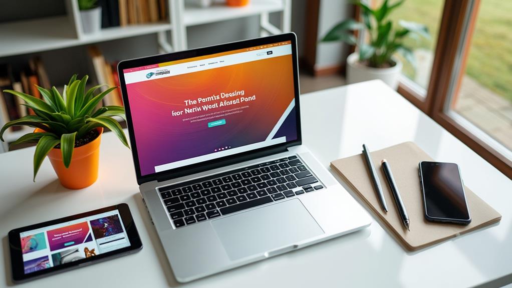
Testing Across Devices
Testing across devices is essential to ensure your responsive design performs well in real-world scenarios. With 90% of users abandoning sites that lack a mobile-friendly experience, it's vital to verify that your web design functions seamlessly across various screen sizes. Begin by using browser developer tools or online services like BrowserStack to simulate different devices and screen resolutions. However, do not rely solely on emulators, as they may not fully replicate the user experience due to hardware and software differences.
Here are four tips to enhance your testing process:
- Use a variety of actual devices: Test on different smartphones, tablets, and desktops to capture a broad spectrum of user experiences.
- Prioritize performance: Ensure your site loads in under five seconds, especially on mobile devices, to retain user engagement.
- Gather user feedback: Implement mechanisms for users to report issues, helping you identify and resolve usability problems.
- Conduct regular retesting: Web design is an ongoing process. Regular testing helps maintain a consistent experience across all devices.
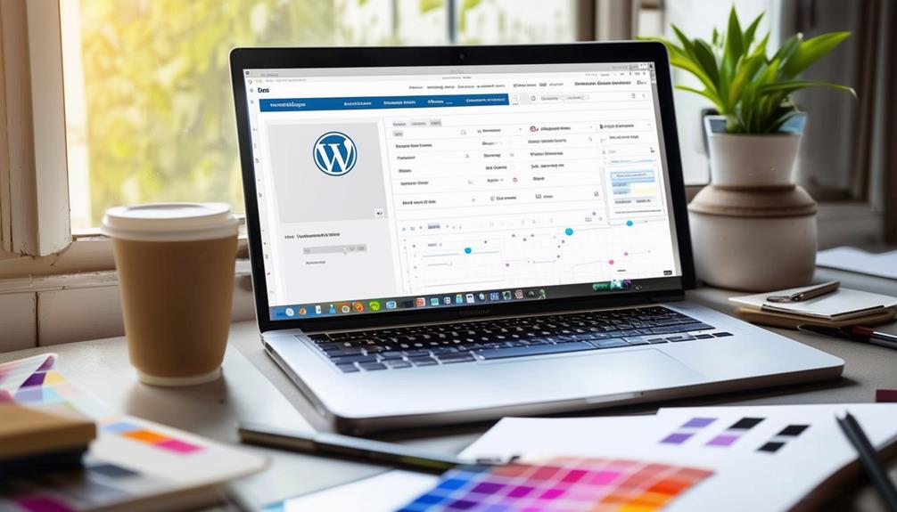
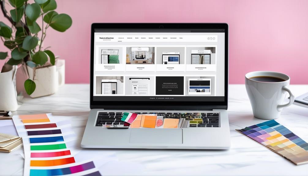
Utilizing CMS Templates

Leveraging CMS templates can revolutionize your approach to responsive design. With options from platforms like WordPress, Squarespace, and Wix, you can create a professional, mobile-optimized website without requiring extensive coding knowledge. These templates are pre-designed to adjust your content automatically, ensuring compatibility with various screen sizes and eliminating the need for manual layout tweaks.
Using responsive templates streamlines your workflow. Drag-and-drop functionalities make it easy to customize your site while adhering to responsive design principles. You can effortlessly arrange elements, ensuring your site looks great on any device. Built-in features like flexible grids and fluid images maintain a cohesive user experience across all screens.
Another advantage is the regular updates and support from CMS providers. These updates ensure your templates stay compliant with the latest responsive design standards, improving both performance and user engagement. By utilizing these templates, you can focus more on your content and less on technical adjustments, confident that your site will remain visually appealing and functional across all devices.
Resources and Support
Embarking on the journey of responsive design is made easier with a wealth of resources and support available to you. To ensure a smooth process and successful outcomes, consider these essential resources:
- New Website Request Form: Start here if you need assistance with site development. This form simplifies and organizes the process of creating responsive designs.
- CMS Training Sessions: These sessions are crucial for mastering content management and implementing responsive design principles on your platform. You'll gain the skills to build adaptive, mobile-friendly websites.
- Accessibility Training: Ensuring your site meets accessibility standards is vital. This training helps you design inclusive websites that offer an enhanced user experience for everyone.
- Digital Communications Team: This team provides expert guidance and support in implementing and troubleshooting responsive design. They are available to answer your questions and offer solutions.
Additionally, the Office of Marketing and Communications provides continuous updates on the latest best practices and resources for responsive web design. With these support systems in place, you'll be well-prepared to craft a successful responsive website.