Creating Interactive Infographics: Engaging Visual Content
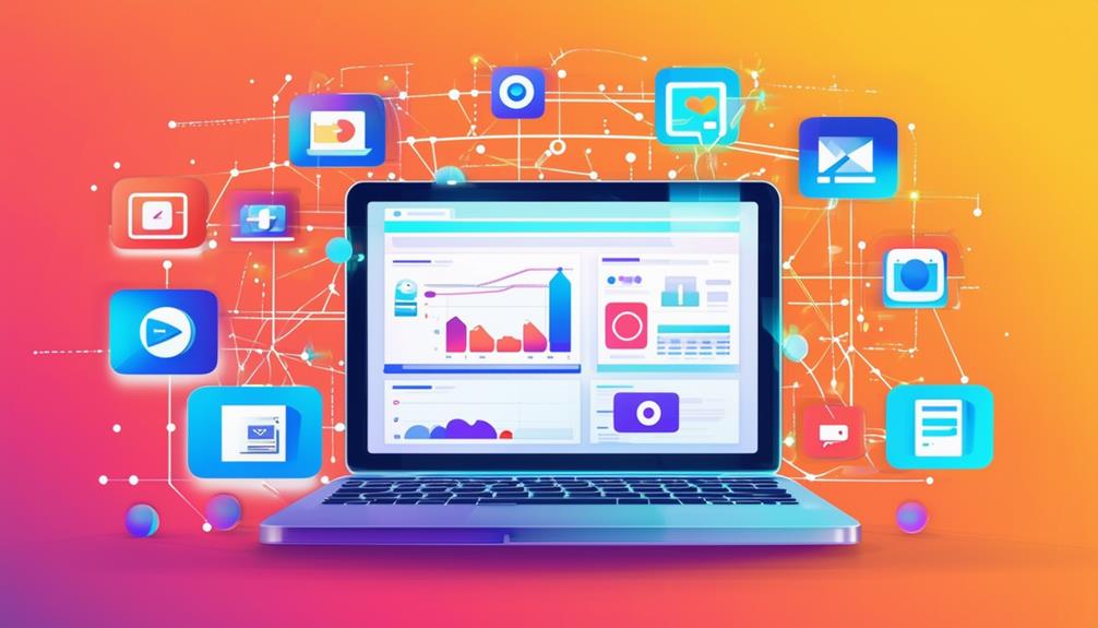
Creating interactive infographics transforms static data into engaging visual content that captures audience attention and enhances comprehension. Utilizing various types of infographics—such as statistical, comparison, and process—simplifies complex information, making it more accessible. Interactive elements like animations, hover effects, and clickable sections invite users to explore, making their experience both enjoyable and informative. Customization options for branding ensure your content aligns with your visual identity, thereby increasing retention and shareability. How can you effectively combine these elements to optimize impact and engagement? Let's delve into that next.
Importance and Benefits
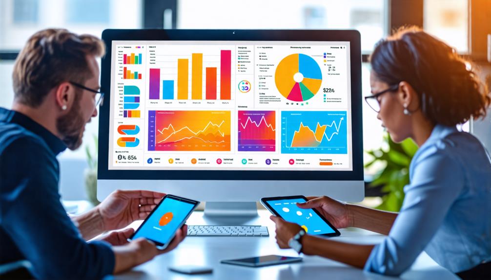
In today's digital landscape, interactive infographics are essential for boosting audience engagement. By requiring user interaction, these visual tools significantly enhance the retention and understanding of complex information. When users actively engage with content, they are more likely to remember and comprehend it, leading to a stronger connection with the material.
Interactive infographics also improve brand awareness and social media shares, with data indicating a 155% increase in engagement through compelling visuals. This not only broadens your reach but also reinforces your brand's presence in the minds of your audience. By incorporating animations and hover effects, you make your infographics more attractive, driving higher user interaction and exploration of your content.
Moreover, these infographics break down complex information into digestible formats, catering to various learning styles. This makes your data accessible and enjoyable for a diverse audience. Visual storytelling techniques facilitate a logical flow of information, enhancing the overall narrative and improving comprehension. The benefits of interactive data visualization are evident: they engage your audience, simplify complex information, and strengthen brand awareness, all while providing an enjoyable and informative user experience.
Types of Infographics
When creating interactive infographics, you'll encounter different types that address various needs. Statistical infographics simplify complex data for easy understanding, while comparison infographics facilitate the contrast of information. Geographical infographics effectively present localized insights, aiding viewers in comprehending spatial relationships and regional statistics.
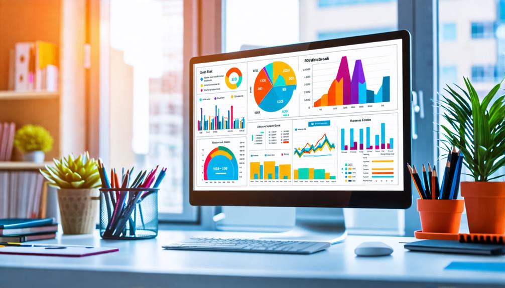
Data Visualization Techniques
Have you ever wondered how to make your data more engaging and easier to understand? Let's explore some data visualization techniques that can transform your information into compelling, interactive content.
Infographic design uses a variety of visual elements to effectively engage your audience. For instance, statistical infographics employ charts and graphs to make complex statistics more digestible, enabling users to quickly and effortlessly grasp insights.
Timeline infographics offer a chronological narrative that helps audiences comprehend the sequence and significance of historical events, making them ideal for visual storytelling. Conversely, process infographics break down intricate workflows into easy-to-follow steps, simplifying the understanding of complicated procedures.
Comparison infographics are particularly useful when highlighting differences and similarities between subjects. By placing visuals side-by-side, you enable your audience to perform quick assessments and make informed decisions. Finally, geographical infographics use maps to provide localized data insights, making it easier to identify trends and patterns within specific regions.
Comparative Visual Infographics
Comparative visual infographics are excellent tools for highlighting both critical distinctions and similarities between multiple subjects. They make it effortless for your audience to understand fundamental differences at a glance. These infographics employ side-by-side visuals, ensuring viewers can quickly compare data points, statistics, or features pertinent to the subjects being analyzed. By simplifying complex data, comparative infographics enhance data retention and support informed decision-making among your target audience.
To effectively utilize comparative infographics:
- Side-by-Side Comparison: Arrange data points or features next to each other for a clear and easy-to-follow visual representation.
- Engage Your Audience: Incorporate interactive elements, such as hover effects or clickable sections, to make the experience more engaging and informative.
- Concise Text: Pair clear visuals with brief, precise text to ensure your audience grasps the key points without feeling overwhelmed.
- Static Infographics: For simpler comparisons or print materials, static infographics can still deliver valuable visual content without the need for interactive elements.
Geographical Data Insights
Geographical infographics transform complex data into engaging visual content by utilizing maps to provide localized insights. Whether highlighting demographic trends, climate patterns, or resource distribution, these infographics make the data more accessible and informative.
Incorporating interactive elements like clickable regions and animated overlays significantly enhances user engagement. Imagine a map where clicking on different areas reveals detailed information, or animated infographics that demonstrate changes over time. These features enable your audience to explore the data in depth and comprehend its implications.
Geographical infographics are particularly valuable in fields such as environmental studies, urban planning, and public health, where geographical context is crucial for understanding the data's real-world impact. Tools like Infogram and Visme enable the creation of detailed maps with customizable options that enhance both aesthetics and functionality. If you aim to communicate complex data effectively, geographical infographics are an indispensable tool.
Creating Infographics
Creating infographics is a straightforward process that anyone can follow to produce visually appealing and informative graphics. Begin by logging into an infographic maker like Infogram. This platform offers a variety of templates, making it easy to customize your design to fit your content needs. No advanced design skills are required, allowing you to bring your data to life effortlessly.
Here are the steps to get started:
- Choose a Template: Select from multiple infographic templates or start from scratch to meet your specific needs.
- Add Visual Elements: Use the drag-and-drop functionality to incorporate charts, images, and icons, making your infographics more engaging and interactive.
- Upload Data: Easily integrate your raw data by copy-pasting or uploading files directly, facilitating the creation of interactive charts.
- Customize: Adjust colors, fonts, and graphics to match your brand, ensuring visual consistency.
Once you're satisfied with your design, you can download the infographic in formats like PDF, PNG, or JPEG. Alternatively, you can embed it on websites for easy sharing and distribution. By following these steps, you can create stunning, interactive infographics that captivate your audience.
Interactive Features
To enhance your infographic, consider integrating animations and hover effects. These not only improve visual appeal but also aid in data comprehension. Additionally, incorporating clickable elements allows users to explore different sections, maintaining their engagement and interest. These interactive features enhance user interaction, making the content more memorable and engaging.
Animations and Hover Effects
Animations and hover effects are powerful tools in the realm of interactive infographics, transforming static data into engaging, dynamic experiences. By incorporating these elements, you can significantly enhance user engagement, drawing attention to key components and promoting exploration of the content. Hover effects enable users to interact with specific sections of the infographic, revealing additional information or insights without overwhelming them with excessive data.
Here's how to effectively utilize these interactive features:
- Animations: Trigger animations through scrolling or clicking to create a dynamic storytelling experience that maintains audience interest in the narrative flow.
- Hover Effects: Use hover effects to let users uncover more details effortlessly, providing an engaging experience without cluttering the visual space.
- Seamless Navigation: Ensure smooth transitions through animated elements and hover effects, enhancing the overall user experience and facilitating the clear presentation of complex data.
- User Engagement: Boost retention rates by making your infographic interactive, encouraging users to actively engage rather than passively consume the material.
Clickable Elements for Exploration
Incorporating clickable elements into your interactive infographics transforms static content into an engaging, exploratory experience. These elements, such as pop-ups, animations, and customizable links, empower users to delve deeper into the material, enhancing their understanding of complex topics. By making data exploration intuitive and user-friendly, you significantly boost audience retention. Users actively interact with your content rather than passively consuming it, which keeps them engaged for longer periods.
| Element Type | User Benefit |
|---|---|
| Pop-ups | Immediate access to detailed information |
| Animations | Visually engaging and easier to comprehend |
| Customizable Links | Seamless navigation with tailored content |
Adding clickable features also increases the likelihood that your interactive infographics will be shared on social media. Engaging and easily navigable content encourages users to share it, thereby enhancing your visibility and overall engagement rates. Tools like Visme offer customizable links that enhance the user experience, providing a seamless way to navigate through the infographic. The objective is to create compelling content that not only captures attention but also promotes deeper interaction and thorough data exploration. This approach ensures your infographics both inform and captivate, leading to improved audience retention and engagement.
Enhanced User Interaction
Enhanced user interaction transforms static infographics into dynamic and engaging experiences. By incorporating features such as animations and hover effects, you can significantly enhance how your audience interacts with your content. When specific sections of your infographic come to life, it not only grabs attention but also encourages deeper exploration.
Clickable elements within your infographics facilitate deeper investigation of data. Users can access supplementary information seamlessly, making the experience more engaging and educational. Here are four ways to amplify user interaction in your infographics:
- Animations: Incorporate dynamic effects to highlight key data points, making them more memorable and engaging.
- Clickable Elements: Enable users to click on sections of the infographic to reveal more detailed information, fostering a deeper understanding.
- Hover Effects: Implement hover effects to provide instant feedback, keeping your audience engaged as they navigate.
- Scrollytelling: Integrate scrollytelling to change content based on user scrolling, maintaining interest and encouraging exploration.
These features not only increase audience retention but also cater to diverse learning styles, improving comprehension and retention of complex data. Through real-time feedback and interactive pathways, you create an engaging, user-centered experience that keeps your audience coming back for more.
Customization and Branding
Customizing and branding your infographics is essential for maintaining a consistent visual identity, and Infogram's brand kit simplifies this process. With expertly designed templates, you can easily customize your infographics to meet specific branding requirements. Adjust color palettes, fonts, and layouts to ensure every piece of content aligns with your brand's aesthetic.
Infogram offers multiple plans to cater to your branding needs. Basic and Pro plans include the Infogram logo by default. However, upgrading to Business, Team, or Enterprise plans allows you to upload your custom logo (optimal dimensions: 50px height x 185px width). This feature enhances brand recognition and can be applied to individual projects or set globally across the platform. Additionally, you can embed links in your logos for added functionality.
The platform supports responsive web and mobile layouts, ensuring your infographics look excellent on any device. Infogram also provides a variety of data representations with different chart and map types, allowing you to present your data compellingly while maintaining your brand's visual consistency. By leveraging these customization options, you will create engaging and professional infographics that effectively reinforce your brand identity.
Collaboration and Analytics
Building on the strong foundation of customization and branding, effective collaboration and insightful analytics are crucial for enhancing your infographics. Real-time collaboration allows team members to work simultaneously, boosting productivity and communication efficiency. Managing user access by setting up view-only or edit permissions enables you to control who participates in the design process.
To streamline revisions and improve the final product, gather feedback through comments on specific elements within the infographic. This targeted approach not only accelerates revisions but also ensures clear communication. Additionally, analytics tools offer valuable insights into how users interact with your infographics. By tracking views, interactions, and shares, you can make data-driven decisions to optimize your content for better engagement.
Here's how to effectively implement collaboration and analytics:
- Real-time collaboration: Foster teamwork by allowing multiple users to edit simultaneously.
- User access: Control participation with view-only or edit permissions.
- Feedback: Use comments for targeted and efficient revisions.
- Analytics tools: Leverage data for content optimization and engagement strategies.
Related posts