

First impressions are important when it comes to anything, and doubly so for websites. Your website is not a physical location someone had to drive or walk to. If they don’t like what they see on your website, they’re going to dismiss it as not worth their time and click away. This of course, makes it crucial that your website not only present a spectacular first impression, but that it also keeps to its theme throughout its design to keep visitors engaged and appealed.
If you’re new to website design, you might need a little help to get you started down the right path. And that is exactly what this post will be focusing on. Theming ideas that, while they may seem bearable to you, might end up turning a lot of people off. Even if just the home page is unappealing to visitors, that will result in a lot of traffic passing your website by instead of investigating further to see if it gets any better. This is to be expected on the internet; where every question in the world has a million websites answering it and clamoring for attention. Such a competitive world demands that your website stick out above the rest, let us show you how. Moreover, find out the best online pokies for australia this year.
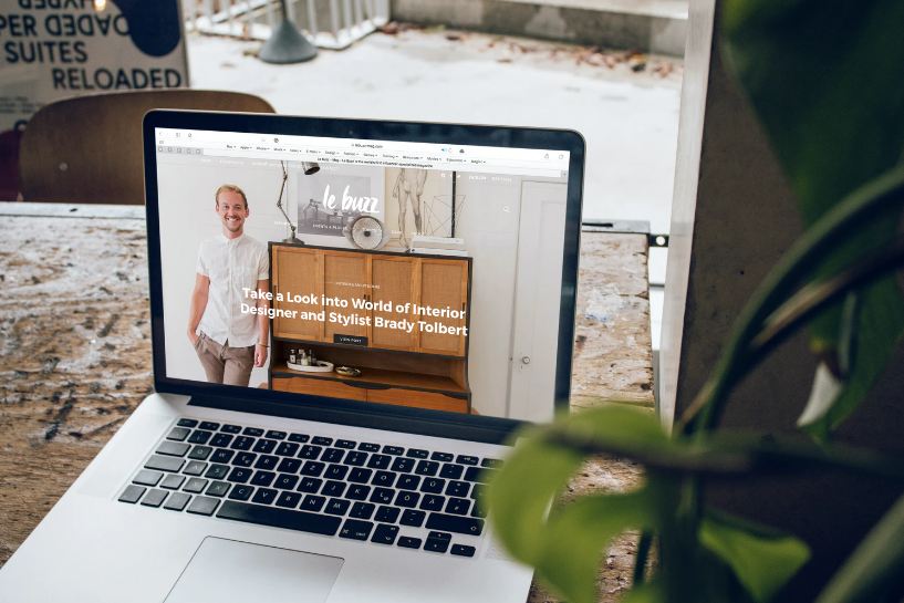
It’s the Little Things that Count
Before we move on to the meat of this post, it is important that you realize that dismissing small issues on your website as not a huge problem is a big no-no when it comes to website design. What to you may seem like a small annoyance, might just end up being the reason a person visiting your website decides to close it and move on. And what’s even more important for you to realize is that if you keep brushing off small problems in your website’s theming, they will all add up into one horrible, jumbled mess.
A website screams polish and refinement when every little thing about it works and looks like a user expects it to. The backend database isn’t what’s most important. The way the pages collect and relay information isn’t what’s most important either. It’s the look and feel of the website. This is why focusing on the mobile view of a website is emphasized in web design classes. You’re not going to retain traffic if your website is just a chore to use or even just look at.
The Colors Clash Horribly
‘Beautiful and colorful design’ treads a very line with ‘horrible and seizure-inducing design’. It might seem like a good idea to throw in a lot of colors at once, but be careful or you’ll end up with a rainbow website that is painful to look at. More colors don’t always equal better visuals. If you have a history of picking horribly clashing clothing, don’t be afraid to seek help with your website design, preferably from an expert. Bright, unsightly contrasts will have people clicking off your website faster than you can say “it gets better!”.
But, as with almost anything in website design, contrasting colors are a double-edged sword. While too many may be horrible, too few might make your website appear incredibly boring. No one wants to browse through a website that resembles a government document discussing the taxation of pharmaceutical imports. You’ll have to strike a balance between elegant and popping, making it neither too bland, nor too visually bombastic.
Stick to One Universal Look
Continuing on the discussion above about very boring and very exciting websites, be careful not to end up with a mismatch of both extremes. If there is one thing that shows that a website has been carefully placed together, it’s that it looks the same across all pages. All-too-often, newcomers to website design end up making a website that drastically changes its tone from one page to the next.
The home page will be a crowded mess linking to the various pages on the website, while those subsequent pages would be dead and lifeless with barely any content. One page would be using a completely different color palette, another would be making use of completely different fonts. This sort of design leaves a visiting person really confused or outright appalled, and they will have no qualms about opening up some other website.
Keep it Relevant
It may seem shoving in as much cool stuff into your website would be a plus, but it really isn’t. In today’s age, people want to be given things straight and simple. Your website won’t be popular if you have unnecessary designs and flashy patterns all over your website. Sure, by all means prettify your website by adding in a handful of visually touches here and there, but don’t overdo it to the extent that your website looks like a child’s coloring book. A particularly untalented child’s coloring book. Meanwhile, casinoclic casino en ligne offers a high welcome bonus and its game library is full of exciting games as well.
Planning Ahead is Advised
If you have a theme outline already in mind when you’re making your website, you’ll have much more success incorporating a theme later on. Winging it as you go along is highly ill-advised, as that will only lead to a website with theming that’s all over the place and visuals that scream ‘unfinished’ and ‘rushed’. Plan ahead for each page you make, as well as for the overall design of the website, and you will without a doubt have a very attractive website to show the world.
Keep Your Website Responsive
One of the biggest mistakes you could make when applying a theme on your website is choosing one that clashes with your website so horribly that it ends up making it an unresponsive mess. Websites are supposed to be fluid in design and response. If your website starts lagging on someone’s phone as it tries to load all the bloated menus, or if it becomes so cluttered that getting to where you need to go requires you to wade through a sea of useless content, don’t be surprised if people start ignoring your website or even actively badmouthing it online. Leave all the cluttered and slow mess in the backend and keep the front as polished as possible.
Test, Test, and Test Some More
Lastly, you will never know how your website feels to use if you never test it thoroughly yourself. A key component of website design is testing every little change you’re about to incorporate, and then testing it again just to be sure. Test your website on phones, tablets, laptops, desktop computers, and on every browser in the world. Never ever apply a change, especially something as big as a whole website-wide theme, before having tested it vigorously. Bring in other testers just for good measure, and pay attention to their critiques.
Conclusion
And that’s about it. It may seem daunting at first if you’re a newcomer, but after a few months of experience under your belt you’ll be an expert yourself. Remember, if confused, just keep your website as simple but engaging as possible. Augment it with improvements later on down the line if you must, but never rush out a website that’s more cumbersome to use than having to do the dishes. For a similar article, consider giving our post on infographics and whether they should always be used a read. Or, if you’re unsure of what to use to design your totally cool website logo, read up on the top 10 software you can use to design your logo.