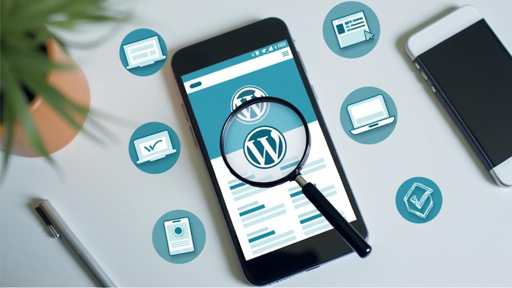
How to Create a Mobile-Friendly WordPress Website
Creating a mobile-friendly WordPress website is essential in today's digital landscape, where mobile traffic often exceeds desktop visits. Begin by selecting a responsive theme that adapts seamlessly to various screen sizes. This foundational step ensures a consistent user experience across devices. Additionally, optimizing images and using essential plugins like AMP can significantly improve load times. Enhancing site navigation with touch-friendly menus will further boost user experience. By integrating these elements, you can ensure your website remains user-friendly and accessible on all devices. Let's explore these strategies in more detail to guarantee your site's effectiveness and reliability.
Importance of Mobile Optimization
In today's digital age, mobile optimization is crucial. With over 50% of Google searches occurring on mobile devices, ensuring your website is mobile-friendly is essential. A mobile-optimized WordPress site not only enhances user experience but also positively affects search rankings. Since 2015, Google has favored mobile-friendly sites, rewarding those that improve user engagement on mobile platforms.
By focusing on mobile optimization, you create a responsive design that adapts seamlessly to various screen sizes. This approach ensures a smooth mobile experience, which is vital as users spend an average of six hours daily on their mobile devices. A well-optimized site reduces bounce rates, as visitors are more likely to stay on a site that functions smoothly on their phones or tablets.
For e-commerce businesses, the importance of mobile optimization is even greater. Studies show that 61% of consumers prefer purchasing from mobile-optimized sites. This preference underscores the need for a mobile-friendly WordPress site to accommodate modern shopping behaviors. Ultimately, prioritizing mobile optimization not only boosts user satisfaction but also enhances search rankings and e-commerce success, ensuring your site thrives in today's mobile-centric world.
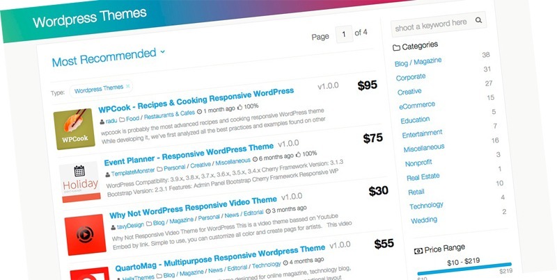
Choosing a Mobile-Friendly Theme
Enhancing your WordPress site for mobile devices begins with selecting the right theme. Mobile-friendly themes are essential because they automatically adjust to different screen sizes, ensuring an optimal user experience across all devices. The WordPress repository offers a wealth of responsive themes ideal for mobile optimization.
When selecting a theme, prioritize mobile-responsive options. All themes available on WordPress.com are mobile-responsive, making them perfect for enhancing mobile design and performance. If you're considering third-party themes, always verify their mobile-friendliness by reviewing user feedback and documentation.
Responsive themes often include customizable settings to tailor their appearance specifically for mobile devices. These settings enable you to make adjustments that adhere to best practices for mobile design, significantly improving site performance and user engagement on mobile platforms.
Essential Plugins for Mobile Optimization
To enhance your mobile-friendly WordPress site, begin by integrating responsive design plugins such as the AMP plugin, which boosts loading speed on mobile pages. Additionally, employ performance improvement tools like 10Web Booster and caching plugins to ensure fast loading times and a seamless user experience. Make sure to regularly update these plugins to maintain compatibility with the latest mobile optimization techniques.
Responsive Design Plugins
For a seamless mobile experience, leveraging responsive design plugins is crucial. These plugins ensure your WordPress site's layout adapts perfectly to various screen sizes, significantly enhancing the user experience. By making your site mobile-friendly, you increase engagement and reduce loading times.
One essential plugin to consider is the AMP plugin, which accelerates loading times on mobile devices. Faster loading times decrease the likelihood of users abandoning your site. Another valuable tool is 10Web Booster, which enhances your mobile site performance, ensuring smooth operation even on the latest WordPress versions.
Additionally, WPForms can help create mobile-friendly forms. Simplified input fields and improved usability reduce form abandonment rates, contributing to a seamless user experience. Don't forget to optimize your images and ensure they are responsive. This maintains quick load times and visually appealing content across all mobile versions of your site.
Selecting the right responsive design plugins and ensuring they integrate well with your existing site components is vital. This prevents any compromise in mobile usability and performance, keeping your WordPress site optimized and efficient.
Performance Enhancement Tools
To improve your WordPress site's performance for mobile users, leveraging essential plugins can significantly enhance user experience. Start by using the AMP plugin to create streamlined versions of your pages. This plugin drastically improves loading speeds and increases user engagement, ensuring your content loads quickly even on slower connections.
Next, consider 10Web Booster for comprehensive performance optimization. This plugin automates critical tasks such as image optimization and caching, significantly reducing load times on mobile devices. With 10Web Booster, you can avoid the manual hassle of optimizing images or configuring complex caching systems.
Incorporate lazy loading plugins to further boost site speed. These plugins ensure that images load only as they enter the viewport, reducing initial load times and enhancing mobile usability. Be sure to select lightweight plugins that integrate seamlessly with your existing site components. Heavy plugins can slow down your site and negatively impact mobile performance.
Lastly, regularly updating your plugins is essential for maintaining optimal performance and compatibility with the latest WordPress versions. By focusing on these performance enhancement tools, you'll ensure your mobile visitors enjoy a smooth and fast browsing experience.
Optimizing Images and Media
Optimizing images and media is essential for ensuring your WordPress website loads quickly and efficiently on mobile devices. Begin by compressing images to reduce file sizes without sacrificing quality. This practice enhances user experience by decreasing web page loading times. Utilize tools like Google PageSpeed Insights to identify unoptimized images and make necessary adjustments.
Implement responsive media queries to ensure images adapt to various screen sizes, improving site accessibility. This guarantees your images display correctly whether viewed on a smartphone, tablet, or desktop, providing a consistent and pleasant user experience across all devices.
Incorporate lazy loading techniques to enhance initial load times. Lazy loading only loads images when they are about to enter the viewport, reducing the amount of data downloaded during the initial page visit. This significantly accelerates the time users can interact with your site.
Additionally, consider using the WebP format for images. WebP provides high-quality visuals at smaller file sizes compared to formats like JPEG and PNG, further accelerating your site. Regularly optimizing images and media is a crucial step in maintaining a fast, mobile-friendly WordPress website.
Enhancing Site Navigation
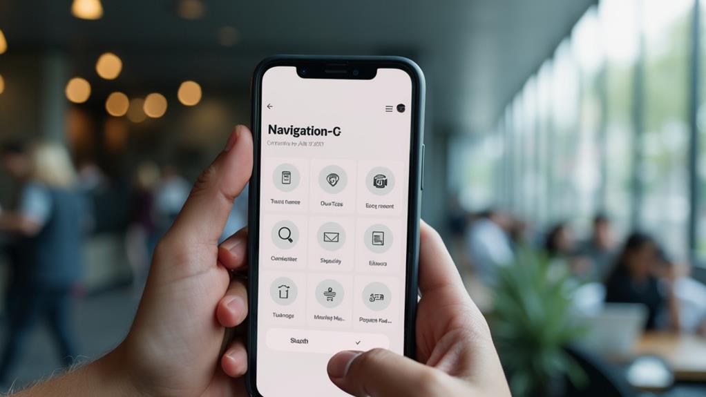
To enhance navigation on your mobile-friendly WordPress website, simplify your menu structure to reduce clutter and make key items easily accessible. Incorporate touch-friendly dropdowns and limit the number of menu items to 5-7, ensuring a search bar is available for quick access. Implement responsive designs, such as hamburger menus, to ensure users can navigate effortlessly without needing to zoom.
Simplify Menu Structure
A streamlined menu structure enhances mobile browsing by allowing users to find key content quickly without unnecessary scrolling or searching. To simplify the menu, limit the number of items to 5-7 main options. This prevents overwhelming users and makes each item easily tappable. Responsive menus and touch-friendly dropdowns further improve navigation on smaller screens.
Including a search bar within the mobile menu is another effective strategy. It enables users to locate specific content quickly, enhancing their overall experience. Regular testing using tools across different devices is essential to identify and address any usability issues, ensuring a smooth and consistent experience for all mobile users.
Implement Touch-Friendly Navigation
Enhancing site navigation on mobile devices requires touch-friendly features to improve user experience. For a mobile-friendly WordPress site, start with larger buttons and links, ideally at least 44x44 pixels. This ensures users can tap accurately, reducing accidental clicks and enhancing usability.
Incorporate dropdown menus designed for easy finger access to streamline navigation without cluttering the screen. Additionally, a search bar in the navigation menu allows users to quickly find content, thereby reducing frustration.
Limit your menu items to 5-7 key options to avoid overwhelming users, making navigation straightforward and efficient. Implement sticky navigation to keep essential links visible as users scroll, thereby enhancing accessibility and encouraging further exploration.
Here's a quick overview:
| Feature | Benefit | Implementation Tip |
|---|---|---|
| Larger Buttons | Easy tapping, fewer errors | Use at least 44x44 pixels |
| Dropdown Menus | Streamlined navigation, reduced clutter | Design for easy finger access |
| Search Bar | Quick content access, reduced frustration | Integrate within the navigation menu |
| Limited Menu Items | Prevents user overwhelm | Limit to 5-7 key options |
| Sticky Navigation | Vital links always visible | Improves accessibility and exploration |
Creating Mobile-Friendly Forms
When designing a mobile-friendly WordPress website, crafting efficient and user-friendly forms is paramount. Mobile-friendly forms ensure your site is accessible and engaging on mobile devices. Utilize trusted form builders like WPForms, used by over 6 million sites, to create forms that not only look great but also function seamlessly across all devices.
For enhanced user engagement, focus on collecting only essential information such as name and email. This approach reduces form abandonment rates and streamlines the process, which mobile users value. Implementing multi-page forms can further elevate user engagement by segmenting lengthy processes into manageable steps, enhancing user-friendliness.
Regularly test your forms on various mobile devices to ensure they function correctly and maintain usability. Pay close attention to touch interactions and adjust layouts or field sizes as necessary. A well-designed form significantly improves user experience and boosts engagement rates.
Testing Mobile Friendliness
Ensuring your WordPress website is mobile-friendly is crucial for user satisfaction and engagement. To evaluate your mobile site, start by utilizing Google's mobile-friendly testing tool. Enter your site's URL for an instant assessment of its mobile responsiveness, which will identify issues and recommend improvements.
Next, regularly check your site's performance using Google's PageSpeed Insights. Aim for a score between 90 and 100 to ensure optimal loading speed and a seamless user experience. This tool provides detailed reports on Core Web Vitals, essential for diagnosing potential mobile usability issues such as loading speed, interactivity, and visual stability.
Here are three steps to comprehensively test your mobile site:
- Use different devices: Test your site on various screen sizes and devices to uncover unique display challenges.
- Leverage automated testing solutions: Tools like BrowserStack can simulate real user conditions, ensuring your mobile site functions well across a range of devices and browsers.
- Monitor Core Web Vitals: Use analytics tools to track key metrics, helping you maintain high standards for mobile responsiveness.
Advanced Mobile Strategies
Having established a solid foundation for mobile responsiveness, it's time to delve into advanced strategies that can elevate your site's mobile performance. Start by implementing Accelerated Mobile Pages (AMP) on your WordPress site. AMP significantly reduces loading times, enhancing user experience by up to 85% on mobile devices. This is crucial as Google prioritizes mobile-first indexing, which means a mobile-friendly site will rank better.
Next, utilize lazy loading for images. This ensures that only the images visible in the viewport load initially, improving page speed and reducing initial load times by up to 30%. Pair this with a responsive theme to ensure your site adapts well across different devices.
To further enhance website speed, leverage a Content Delivery Network (CDN). CDNs store cached versions of your site closer to your users' geographical locations, decreasing latency and improving load times for mobile users.
Regularly analyze web traffic and user behavior through tools like Google Analytics. Identifying high bounce rates on mobile can prompt necessary optimizations to retain users. Continuously test your mobile site across diverse devices and browsers to guarantee a consistent user experience and to identify and resolve mobile usability issues before they affect site performance.
Maintaining Mobile Security

In the current online environment, securing your mobile-friendly WordPress site is essential for maintaining user trust and protecting sensitive data. To ensure your site remains secure, focus on the following key areas:
- Implement SSL Certificates: Installing SSL certificates on your WordPress site encrypts user data, crucial for secure mobile transactions. This step not only builds trust but also protects sensitive information from potential breaches.
- Use Security Plugins: Enhance your site's security by using trusted security plugins like Wordfence or Sucuri. These plugins provide firewall protection, malware scanning, and are specifically designed to safeguard mobile-friendly sites from various threats.
- Regular Updates and Monitoring: Keeping your WordPress core, themes, and plugins updated is critical for patching vulnerabilities. Regularly conduct security audits and monitor for unusual activity to identify and address potential threats early.
- Improve User Authentication: Implementing two-factor authentication adds an extra layer of security, protecting your site and mobile users from unauthorized access.