How to Make Your WordPress Theme Mobile-Friendly

When making your WordPress theme mobile-friendly, the first crucial step is selecting a responsive theme that adapts seamlessly to various screen sizes. This ensures your site maintains its layout integrity across different devices. It's also important to test your theme using tools like Google's mobile-friendly test to identify and address potential issues. Furthermore, optimizing images and fonts is essential for faster loading times.
However, achieving a smooth mobile experience involves more than just these basics. Consider implementing responsive menus and improving site performance through the use of a Content Delivery Network (CDN). Let's explore these steps in detail to make your site truly mobile-friendly.
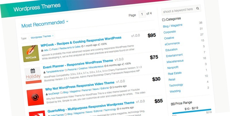
Choose a Responsive Theme
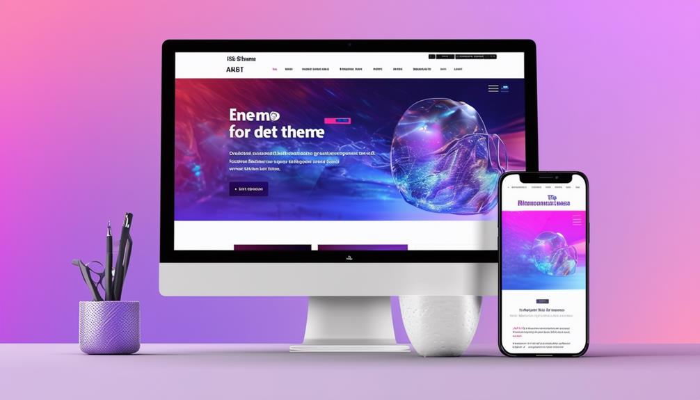
Selecting a responsive theme ensures that your WordPress site automatically adjusts to varying screen sizes, providing an optimal viewing experience on mobile devices, desktops, and tablets. A responsive theme adapts seamlessly, maintaining the integrity of your site's layout and design elements across all devices.
To verify that your theme is truly mobile-friendly, it's essential to check its compatibility with different devices. A theme that performs well on all screen sizes can significantly enhance user experience and boost your SEO rankings. Look for themes with positive user reviews and high ratings specifically for mobile responsiveness, as this indicates reliable performance across various devices.
Customization options are another critical factor. A responsive theme with robust customization features allows you to tailor the design specifically for mobile users. This flexibility ensures that your site is not only visually appealing but also functionally effective on smaller screens. By selecting a theme with comprehensive customization options, you are enhancing your site's mobile-friendliness, which can lead to increased user engagement and satisfaction.
Test Your Mobile Site
Testing your mobile site is essential to ensure it delivers a superior user experience across all devices. Begin by using Google's free mobile-friendly testing tool. This tool allows you to evaluate your site's responsiveness and provides actionable insights for improvement. Make sure to test your site on various screen sizes to confirm it adapts well to different devices.
If you manage multiple URLs, consider using the Mobile-Friendly Test API for automated testing. This API enables you to benchmark your site's mobile-friendliness across numerous pages, saving you significant time and effort. Based on the test results, you can make necessary design adjustments to enhance your site's responsiveness and overall user experience.
Here's a quick reference table to guide you through the testing process:
| Step | Description |
|---|---|
| Use Mobile-Friendly Testing Tool | Evaluate your site's responsiveness. |
| Test on Different Screen Sizes | Ensure adaptability across various devices. |
| Use Mobile-Friendly Test API | Automate testing for multiple URLs. |
| Benchmark Mobile-Friendliness | Identify areas requiring improvement. |
| Make Design Adjustments | Enhance responsiveness based on test results. |
This structured approach ensures your mobile site is thoroughly tested and optimized for a seamless user experience.
Optimize Images and Fonts

After confirming your site is responsive, the next crucial step is to optimize images and fonts to enhance both loading speed and visual appeal on mobile devices. Begin by utilizing image optimization tools to reduce file sizes. Smaller images load faster, thereby improving your WordPress theme's mobile-friendly performance. Select appropriate formats, such as JPEG for photographs and PNG for graphics, to ensure compatibility across various mobile browsers.
For fonts, consider using web fonts like Google Fonts, which offer responsive typography that adjusts seamlessly to different screen sizes. Implement CSS media queries to adjust font sizes based on screen dimensions, ensuring text remains legible on all devices. This step is vital for maintaining a clean, professional look and enhancing user experience.
Test your site on multiple mobile devices to ensure that images and fonts display correctly. Check for clarity and legibility, making adjustments as necessary. Responsive design requires that every element, from images to typography, adapts fluidly to different screen sizes. By focusing on optimizing images and fonts, you not only enhance loading speed but also ensure your WordPress theme is genuinely mobile-friendly. This meticulous attention will make your site more appealing and functional for mobile users.
Implement Responsive Menus
To make your WordPress theme mobile-friendly, focus on optimizing your menu layout and using a flexible design. Ensure your menus adapt seamlessly to various screen sizes and remain easily tappable for users. Test your responsive menus on multiple devices to verify they provide a smooth navigation experience across all platforms.
Optimize Menu Layout
For an optimal mobile experience, start by implementing hamburger menus to keep your navigation clean and condensed. In your WordPress theme, a mobile-friendly menu layout is essential. Hamburger menus help maintain a sleek design, ensuring your responsive menus adapt seamlessly to different screen sizes. This makes mobile navigation straightforward and intuitive.
When optimizing your menu layout, prioritize essential items to enhance mobile usability. Avoid clutter by including only necessary links, making it easier for users to find what they're looking for. Prominently place clear call-to-action buttons within thumb reach to encourage user engagement. These buttons are crucial for directing users to perform specific actions, such as signing up for a newsletter or making a purchase.
Additionally, test various menu layouts and placements to determine what works best for your audience. User engagement often increases when navigation is intuitive and accessible. Consider how different screen sizes affect your design and adjust accordingly. By focusing on a user-friendly mobile navigation experience, you'll improve overall satisfaction and encourage repeat visits to your site. Remember, a well-optimized menu layout can significantly enhance your WordPress theme's mobile-friendliness.
Use Flexible Design
Responsive menus are crucial for a seamless mobile browsing experience on your WordPress site. They adjust to different screen sizes, ensuring smooth navigation for users on smartphones and tablets. One effective approach is using flexible design elements like collapsible menus and hamburger icons. These features keep your site clean and organized while providing accessibility to all menu items.
By implementing responsive menus, you enhance user engagement and reduce bounce rates. When visitors can easily find what they need, they are more likely to stay longer and explore more pages. Flexible design optimizes navigation, improving the overall user experience across different devices.
Collapsible menus and hamburger icons are particularly effective. They minimize space usage while maintaining full functionality, creating a seamless mobile experience. This approach is essential for mobile-friendly WordPress themes, catering to users across various devices.
Incorporating responsive menus into your WordPress theme ensures that your site adapts to different screen sizes and provides easy navigation. This not only enhances user satisfaction but also helps keep bounce rates low, making your website more successful and engaging.
Use Mobile-Friendly Plugins

Utilizing mobile-friendly plugins such as WP Touch and Jetpack can significantly enhance the mobile experience of your WordPress site. These plugins automatically generate a mobile version of your site, ensuring optimal display across various devices. WP Touch, boasting over 500,000 active installations, offers customizable themes specifically designed for mobile optimization. Jetpack, used by millions of WordPress websites globally, adapts your theme to different screen sizes, providing a consistent user experience on mobile devices.
Incorporating these mobile-friendly plugins not only makes your site more accessible but also boosts user engagement. Visitors are more inclined to stay and explore your site if it is user-friendly on their phones or tablets. This can help reduce bounce rates, keeping users on your site longer and potentially converting them into customers or loyal readers.
Additionally, mobile optimization is crucial for improving your site's SEO performance. Search engines prioritize mobile-friendly sites, so employing plugins like WP Touch and Jetpack can enhance your rankings. This increased visibility can drive more organic traffic to your site, further benefiting your overall online presence.
Enhance Site Performance
Improving your site's performance is crucial for making your WordPress theme mobile-friendly. Start by optimizing images to ensure they load quickly on mobile devices. Tools like Pingdom can help analyze and improve your page load speed, which is vital for mobile SEO. Fast-loading websites are essential for a good user experience and better search engine rankings.
Utilize a content delivery network (CDN) to distribute your content more efficiently. A CDN can significantly reduce server response time, leading to faster loading times on mobile devices. Responsive themes are also important as they adapt to various screen sizes, ensuring your site looks great and functions well on any device.
Aim for a page load time between 0.5 and 2 seconds to achieve excellent mobile performance. This speed range is ideal for keeping visitors engaged and reducing bounce rates. Additionally, consider minimizing HTTP requests and leveraging browser caching to further enhance your site's speed.
Conclusion
You've got the tools to make your WordPress theme mobile-friendly. Start by selecting a responsive theme and thoroughly testing it across various devices. Optimize your images and fonts to ensure quick loading times. Implement responsive menus for seamless navigation. Don't forget to install mobile-friendly plugins to enhance functionality. Boost your site's performance further with image optimization and a Content Delivery Network (CDN). Prioritizing mobile optimization will improve your SEO, visibility, and user engagement. Follow these steps, and your site will be ready for any device.