Responsive WordPress Themes: Why They Matter for SEO

You might wonder why responsive WordPress themes are crucial for SEO. With the surge in mobile traffic, ensuring your site adapts seamlessly to various devices is not just a necessity—it's vital. Google's mobile-first indexing means that a mobile-friendly design directly influences your search engine rankings. Beyond rankings, a responsive theme enhances user experience, decreases bounce rates, and improves page load speeds. So, how does a well-coded responsive theme affect your site's performance, and what features should you consider when selecting one?
Importance of Responsiveness
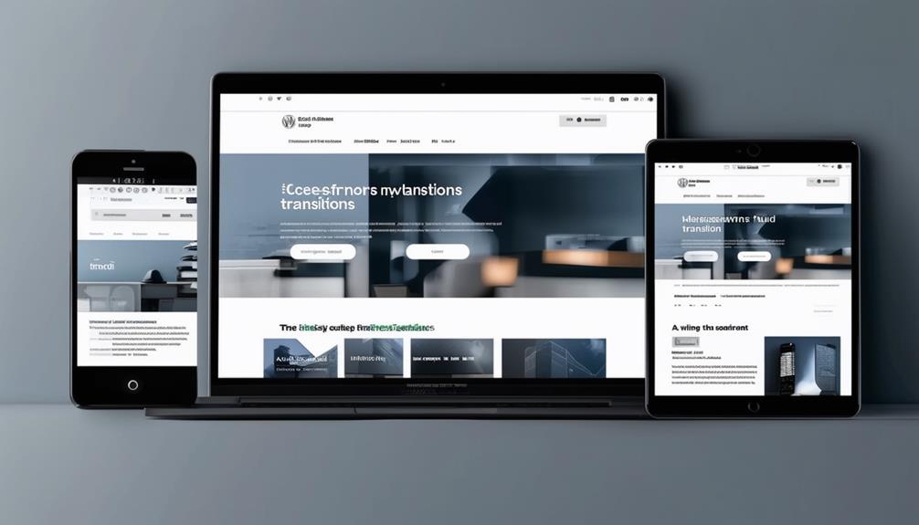
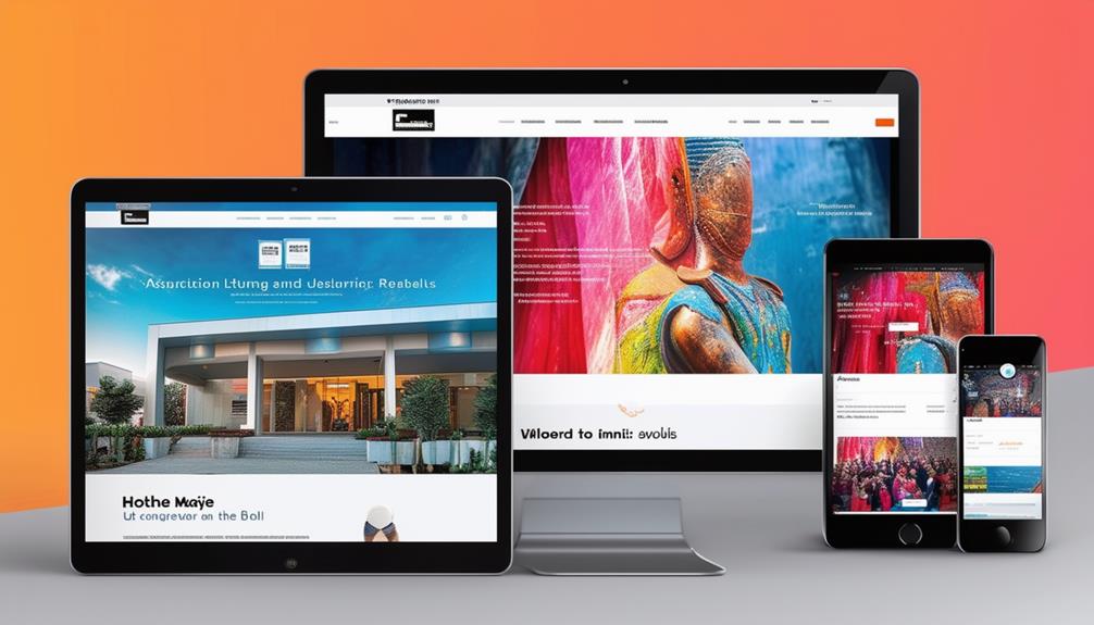
Understanding the importance of responsiveness in WordPress themes is crucial for ensuring your website meets modern user expectations. A responsive WordPress theme allows your website to adapt seamlessly to various devices such as mobile phones, tablets, and desktops. This adaptability is vital as mobile traffic continues to rise, making mobile-friendliness a top priority.
Responsive design directly impacts your SEO by improving your search engine rankings. Google favors mobile-responsive websites in search results, increasing the likelihood that your site will be seen by a broader audience. Choosing a responsive WordPress theme not only boosts your site's visibility but also enhances the user experience.
A responsive website eliminates the need for separate mobile versions, offering a consistent and smooth experience across all devices. This seamless user experience keeps visitors engaged and can lead to higher conversion rates. Implementing responsive design in your WordPress themes ensures that your website remains competitive in today's ever-changing digital landscape, where user expectations are continually evolving.
Mobile-First Indexing
Google now prioritizes the mobile version of your website for ranking and indexing, a practice known as mobile-first indexing. If your site isn't mobile-friendly, you'll likely experience a drop in search rankings. Given the increasing volume of mobile traffic, it's crucial to ensure your website performs well on both desktop and mobile devices.
This is where responsive WordPress themes come into play. These themes automatically adjust to provide an optimal viewing experience on any device, thereby offering a seamless user experience. A mobile-friendly site is considered more valuable by search engines like Google, which can positively impact your search rankings.
A responsive theme ensures that all elements of your website, including images, text, and navigation, function well regardless of the device being used. This adaptability not only elevates user experience but also aligns your site with Google's mobile-first indexing approach. Consequently, using a responsive WordPress theme is a strategic move to bolster your search rankings and cater to the ever-growing mobile audience. Neglecting this critical aspect could hinder your competitiveness in the digital landscape.
Improved User Experience
A responsive WordPress theme significantly enhances user experience by automatically adjusting your site's layout to fit any device. Designing your site with responsiveness in mind ensures that your content is easily accessible and readable across desktops, tablets, and smartphones. This leads to a superior user experience, making your site visually appealing and engaging for all visitors.
Improved user experience has a direct impact on your SEO rankings. Google prioritizes mobile-responsive websites in search results, meaning a responsive theme can boost your visibility. A well-designed, responsive site encourages users to stay and interact with your content, thereby reducing bounce rates and signaling to search engines that your site is valuable.
Additionally, a responsive WordPress theme ensures consistent loading speeds, a crucial factor for user satisfaction. No matter what device your visitors use, they will enjoy a smooth browsing experience, which can further enhance your SEO rankings. In summary, responsive themes improve SEO by offering an intuitive and pleasant browsing experience, ultimately boosting your site's performance and reach.
Enhanced Page Load Speed
Speed is crucial, and responsive WordPress themes significantly enhance page load times by optimizing image sizes and CSS. Utilizing a responsive design ensures your site loads faster through efficient image and CSS optimization. Improved loading times directly impact SEO, as Google prioritizes fast-loading websites, increasing your likelihood of ranking higher in search results.
For mobile users, who comprise a substantial portion of web traffic, page load speed is even more critical. They expect sites to load within 3 seconds. A slow-loading site can frustrate users, leading to poor engagement and higher bounce rates. Conversely, faster loading times maintain visitor engagement, potentially improving conversion rates.
A one-second delay in load time can result in a 7% decrease in conversions, while even a 100-millisecond delay can impact conversion rates by 7%. Therefore, a responsive design not only enhances user experience but also boosts your site's performance and SEO. Focusing on speed sets your site up for success.
Lower Bounce Rates

Improving page load times significantly enhances your site's performance and helps lower bounce rates. Utilizing responsive WordPress themes ensures a consistent user experience across all devices. A mobile-friendly design allows users to navigate and interact with your site easily on smartphones, reducing the likelihood of immediate exits and positively affecting your bounce rates.
Google prioritizes mobile-responsive sites, which can enhance your SEO rankings. When users find it easy to engage with content across various devices, they tend to stay longer, increasing your site's discoverability. A well-designed responsive theme enables users to quickly locate the information they need, further decreasing bounce rates and boosting SEO performance.
Lower bounce rates are vital for SEO as they indicate to search engines that your site is valuable and user-friendly. By adopting responsive WordPress themes, you not only appeal to a broader audience but also enhance the user experience. This facilitates smoother navigation and higher engagement, thereby positively impacting your site's SEO performance.
Better Crawling and Indexing
Responsive WordPress themes are crucial for enhancing your site's SEO performance by facilitating easier crawling and indexing of your content by search engine bots. Google prioritizes mobile-friendly websites, and a mobile-responsive site helps search engines better understand and rank your content. This results in improved crawling and indexing, thereby boosting your SEO rankings.
Here's how responsive design affects key SEO factors:
| Factor | Impact | Result |
|---|---|---|
| Mobile Responsiveness | Enhanced Crawling | Higher Visibility |
| User Experience | Increased Engagement | Better SEO Rankings |
| Search Engine Bots | Efficient Indexing | More Traffic |
Mobile responsiveness is critical because search engines like Google use mobile-first indexing, meaning they primarily consider the mobile version of your site for ranking and indexing. A responsive design ensures that your site's elements are accessible and functional across all devices, leading to higher visibility.
Moreover, a seamless user experience keeps visitors engaged, reduces bounce rates, and signals to search engines that your site is valuable. By ensuring better crawling and indexing, responsive WordPress themes contribute to higher SEO rankings and attract more traffic to your site.
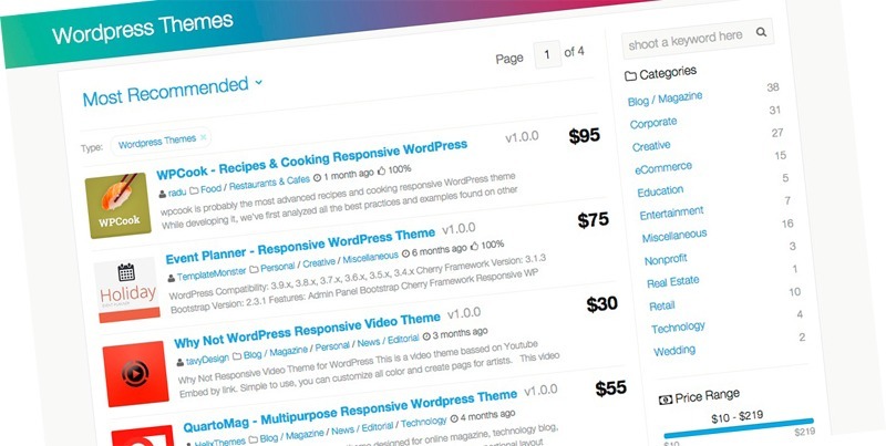
Choosing the Right Theme

Choosing the right WordPress theme is crucial for optimizing your site's SEO and providing a seamless user experience across various devices. A responsive theme adapts your layout and content to different screen sizes, a feature favored by search engines like Google. This adaptability enhances mobile-friendliness, a critical SEO factor given the substantial amount of web traffic from mobile devices.
When selecting a theme, prioritize those with clean code. Clean code ensures efficient site operation, reducing page loading times—another vital SEO element. Fast-loading themes engage visitors and lower bounce rates, indicating to search engines that your site offers a positive user experience.
Additionally, choose a theme that is compatible with popular SEO plugins like Yoast SEO. These plugins assist in optimizing your content and meta tags, further boosting your search engine rankings. Look for themes offering customization options so you can tailor your site's design and functionality without sacrificing performance or SEO.
Ensure the theme receives regular updates. Frequent updates mean better security and improved performance, both essential for maintaining high SEO rankings. By selecting a well-coded, responsive theme with strong SEO features, you establish a solid foundation for your site's success.
Conclusion
Choosing a responsive WordPress theme is essential for achieving SEO success. This ensures your website adapts seamlessly to all devices, in line with Google's mobile-first indexing. You'll benefit from enhanced user experiences, faster load times, and reduced bounce rates. These factors not only boost your search engine rankings but also improve crawling and indexing. Opting for a well-coded, SEO-friendly theme sets your site up for increased visibility and traffic. Don't underestimate the impact of responsiveness on your SEO strategy.