Tips to Prevent your Responsive Wordpress Website from Breaking
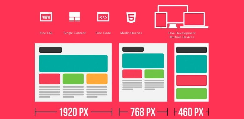
After the latest mobile changes in Google’s indexing algorithm everyone wants to have a mobile friendly website. Responsive web design is used a lot these days to make sites look good on any type of device with any screen size, but there could appear some issues and break the responsiveness of a Responsive Wordpress theme. I will mention some of these tricky points below with ways to avoid and prevent them from happening.
Image attributes
Adding any media to Wordpress is very easy and fast. You can upload any image and insert it in your posts, pages, featured image sections and so on. You would think that adding an image should not pose any threat to the responsiveness of the site. Still, when you add an image in a post the link will look something like:
<a href=“postURL”><img src=“imageURL” alt=“alt text” width="500" height="628" class="alignnone size-full wp-image-249" /></a>
The size attributes are making all the responsiveness fade away as it enforces the displayed size of the image.
You can avoid this issue by removing the attributes in HTML view within the post editor. Also you can place a CSS restriction for all images that will make the image limit it’s size to the size of the element where it’s located in, using this command:
.post img { max-width: 100%; }
There is also a javascript solution that will remove the attributes from any image. Check it below:
document.getElementById('post-image'). removeAttribute('width'); document.getElementById('post-image'). removeAttribute('height');
Also a jQuery solution can be used:
$(".post img").removeAttr("width").removeAttr("height");
Navigation menus
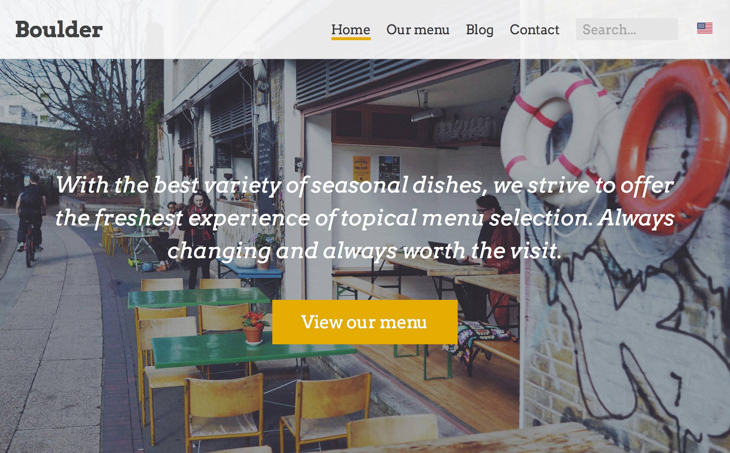
The original design of a theme can be clean and display just a few pages in the main navigation menu. And many authors consider that their user won’t add more than 6 or 7 items in the top menu. As practice showed, there are sites with more than 10 items in the menu and lots of drop downs that will look odd if this hasn’t been foreseen at the design stage. Solution for this is to test early that the menu looks OK even with 10 or 12 items in the main menu.
There will still be an issue with the drop down menus. This can be easily handled by setting the ‘depth’ parameter of the ‘wp_nav_menu()’ and users won’t be able to set drop down menus that are part of a drop down menu in another drop down menu.
Menu for phone screens
With the increase in traffic coming from mobile devices everyone optimizes their websites for small screens as on phones and tablets.
At the moment there is a popular way to make the menu look good on small screens by having a button with 3 horizontal lines to tap on and the menu will come down. That is easy to set if you’re using the bootstrap framework so popular these days. You should still test this and make sure there is enough space between links if you made customizations to the menu.
Other ways to optimize conversion
There are many requests from website owners or marketing departments that want people to see the menu items while they are browsing from their phones and want some different stuff implemented to improve the browsing experience while on the phone and many such features where hard to obtain before, but now using the tools available, you can have sections or links displayed on the mobile devices which will not otherwise be displayed on tablets or desktop versions of the site.
Epilogue
To sum it up, anything you choose to have on your responsive Wordpress theme should be tested early for any device screen and also for any kind of edge case scenario. And also once an admin takes over the site, instruct them on any issues that can break the site or just the responsiveness of the site and how this can be prevented.
We believe that Wordpress will advance and the next versions of Wordpress will make it easier to implement responsive web design and make it harder to break the responsiveness, but until then work on preventing issues and not on fixing when they appear as you will save time and nerves.

