Responsive Web Design: Why Mobile-First Is the New Standard

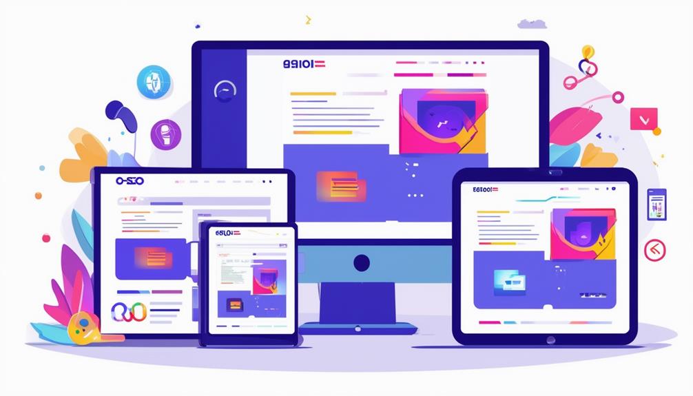
The Shift to Mobile-First Design
As mobile devices continue to dominate web traffic, embracing a mobile-first design is no longer optional but critical. With over 60% of web traffic coming from mobile users, a responsive design guarantees your site meets their needs effectively. By focusing on mobile-first design, you prioritize user experience, offering a seamless experience despite limited screen space.
Content optimization becomes key, simplifying navigation and emphasizing important information to improve user engagement. Google's mobile-first indexing means sites optimized for mobile rank higher, elevating your SEO efforts.
Furthermore, streamlining your content for mobile can greatly improve load times, aligning with mobile users' expectations for quick browsing. Utilizing Content Delivery Networks decreases latency and improves load times, enhancing your site's ability to capture and retain a mobile audience.
Understanding Mobile-First Design Principles
When diving into mobile-first design principles, you'll find that the focus is all about enhancing the user experience on mobile devices from the get-go. By prioritizing the smallest screens, mobile-first design guarantees that vital content is front and center, creating cleaner interfaces and streamlined navigation.
This approach isn't just about aesthetics; it's fundamental for accessibility and engaging over 60% of web traffic that now comes from mobile devices. Furthermore, mobile optimization is crucial for improving search engine ranking, as search engines prioritize mobile-friendly websites for higher rankings.
Key Differences Between Mobile-First and Responsive Design

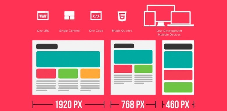
Shifting from the mobile-first approach, it's significant to investigate how it contrasts with responsive design. The mobile-first approach proactively prioritizes mobile usability, crafting a superior user experience for mobile devices from the start. It guarantees that all crucial content is streamlined and refined for smaller screens, enhancing accessibility and improving SEO performance.
On the other hand, responsive design uses fluid grids and media queries to adjust existing layouts to diverse screen sizes, reacting to different devices rather than starting from a mobile perspective. With over 60% of web traffic hailing from mobile devices, the mobile-first approach emphasizes clear navigation and white space, enhancing usability.
While both aim for accessibility, mobile-first design often results in faster load times and a more focused user experience. Additionally, responsive design plays a crucial role in improving search engine rankings by ensuring that sites are mobile-friendly, which is favored by Google.
Benefits of Implementing Mobile-First Design
While embracing mobile-first design, you're prioritizing the mobile user experience, which greatly improves usability and engagement. With over 60% of web traffic coming from mobile devices, focusing on mobile-first design guarantees your responsive websites cater effectively to this audience.
You'll see enhanced SEO performance, as search engines favor mobile-friendly sites through mobile-first indexing. Expect faster load times, since your content is optimized for slower mobile networks, increasing user satisfaction and retention. By concentrating on crucial content, you'll create cleaner websites that meet user needs directly.
Furthermore, mobile-first design reduces redesign costs by addressing mobile usability upfront. In summary, this approach not only improves user experience but also streamlines your web strategy, making it efficient and future-ready.
Mobile-First Design and User Engagement

Embracing mobile-first design is imperative for improving user engagement in the current online environment. With over 60% of internet traffic coming from mobile devices, responsive web design becomes fundamental.
Given that users spend more than three hours daily on smartphones, capturing their attention with a mobile-first approach is essential.
Furthermore, as 83% of social media usage happens on mobile devices, a mobile-first design amplifies your chances of converting social traffic into meaningful interactions. While mobile-first websites naturally improve SEO performance, the immediate benefit lies in retaining users by meeting their expectations and preferences, ultimately leading to higher engagement and satisfaction.
Enhancing SEO With Mobile-First Design
Building on the benefits of mobile-first design for user engagement, let's investigate how this approach can greatly elevate your site's SEO. By aligning with Google's mobile-first indexing, mobile-first design guarantees your content is optimized for mobile devices, amplifying SEO performance.
Mobile-friendly websites load faster, improving user experience and reducing bounce rates—key factors for search engine rankings. Since over 60% of web traffic comes from mobile devices, responsive web design helps you reach a majority audience, enhancing site visibility and engagement metrics.
This approach also increases conversion rates as better user experiences on mobile lead to more transactions. Ultimately, prioritizing a mobile-first design strategy not only boosts SEO but also guarantees your site remains competitive in search engine results pages (SERPs).
For businesses focused on Web design Stevenage, adopting a mobile-first strategy ensures their websites meet both user expectations and SEO standards in an increasingly mobile-driven landscape.
Best Practices for Mobile-First Web Development

When you begin mobile-first web development, start by prioritizing the mobile user experience to meet the demands of over 60% of web traffic that comes from mobile devices. Implement a mobile-first design strategy by designing for smaller screens initially.
This approach guarantees a responsive web design that provides a mobile-friendly design, seamlessly adapting across devices. Focus on best practices like optimizing page load times since users expect quick content access. Intuitive navigation is key—use navigation drawers or hamburger menus for clean layouts.
Regularly test on actual devices with tools like BrowserStack to verify functionality across platforms, enhancing user experience.
- Design with a mobile-first strategy
- Optimize page load times for better engagement
- Verify intuitive navigation for easy content access
- Test on actual devices for seamless performance
Future Trends in Mobile-First Design
As mobile usage continues to dominate the online environment, staying ahead of future trends in mobile-first design is fundamental for businesses aiming to maintain a competitive edge. With over 60% of internet traffic coming from mobile devices, adopting a mobile-first design strategy is imperative. Major search engines prioritize mobile-friendly sites, so confirming your responsive website meets these standards is essential for higher search rankings.
Final Thoughts
Mobile-first design has redefined the landscape of responsive web development. As smartphones dominate how people interact with the internet, prioritizing mobile users is no longer optional—it’s essential. From enhanced user experience to better SEO performance, the benefits of mobile-first design are both immediate and long-lasting.