The Worst Logos in Marketing History

An integral part of a business that provides a service or product is the brand. Therefore, many top echelons in marketing and designing spend most of their time on branding, and it can be a game-changer for the company. One of the most important aspects of branding is the logo. After all, the logo of a brand/company gives the first impression to the customer; and as the saying goes, "you only get one chance to make a first impression." or the more famous "first impression is the last impression." Therefore, many businesses spend hundreds of thousands to millions of dollars to create the perfect logo.
Designing the logo can be a complicated process, as it involves many stakeholders, ideas, and revisions. Hence, a bad judgment can be too costly for the brand. We have compiled a list of the worst logos in the marketing history that had all the wrongs from unreadable fonts, confusing graphics, and horrible aesthetics. If you want to make a great logo, then don't follow these real-life examples.
Let's look at the 15 worst logos in the history of branding:
U.S. Open
To commemorate the 50th Anniversary of the U.S Open's tournament. The official tennis association hired a NewYork based design agency to rebrand the logo. There was only one problem! The design firm decided to change the iconic flaming tennis ball from the original logo and replace it with a swoosh icon. The new logo was great for an airline company rather than a professional tennis competition.
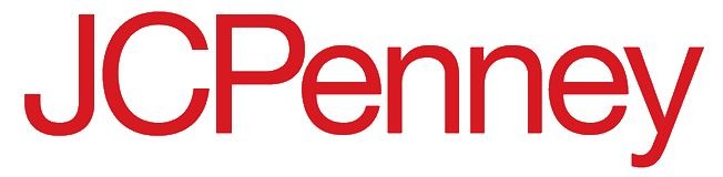
JCPenney
The letter mark logo of JCPenney was far from being easy-to-read, concise, and clean, unlike its predecessor. The new logo was shown to the public in 2012, and the public had only one response; which brand is it? It was a disaster for the company, which affected consumer awareness and led the company to issue an apology. They even went as far as to request their customers to please come back. Sometimes less is less; that is why a focus group always helps.
Hershey's Chocolate Bar
The original logo of Hershey's had it all from minimal aesthetics, clearly mentioning the brand's name and the chocolate bar packaging outline. Just by looking at the original Hershey's logo, you could've guessed that it's a logo for a candy bar. The new logo revealed to the public became a laughing stock. The candy bar fans were not excited, and the use of the Hershey's kisses silhouette resembled the poop emoji, which is a big NO for a food brand.
Pizza Hut
We all remember the Pizza Hut logo that had the company's name, a small red roof on top of it. The latest logo met with criticism from the designing fraternity as Pizza Hut opted to ditch the roof 'hut' from the logo and use an unflattering font typed over the pizza sauce. Though they had variations of the logo, they never deviated from what it represented until 2014. When they completely overhauled the logo.
Gap Clothing
The Gap is an American clothing brand. The original logo was typography over a blue background. Their typography was so iconic that GAP used it as a design print for their clothes, especially the hoodies. But when they decided to change the logo to more of a sleek and modern look. It backfired, and a public outcry forced the brand to change back the logo. However, the newest logo is inspired by the old logo and sticks to the roots.
2012's Olympic Logo
Olympic is an event that is watched around the globe. Therefore, each hosting country tries its utmost best to showcase the perfect logo. However, such was not the case in the 2012's Olympic logo hosted by London. It was such a terrible logo that it attracted unwanted publicity around the world. The logo was ridiculed over the internet, and it had more negative comments than positive ones. It's considered the top ugliest logo in a sporting event competition.
OGC (Office of Government Commerce)
Does the orientation of the logo matter? Well, in the logo for the Office of Government Commerce, which is OGC mattered. It's a pretty standard logo using abbreviations, but the picture becomes clearer when you rotate the logo to 90 degrees. You can see the logo creates a shape that can be offensive to people.
AOL
Helvetica is loved by many designers because of its modern font style. This font has garnered so much popularity that it has become overrated. Though, the people at AOL loved the font so much that they used the font as their own brand logo. Many renowned designers think AOL took a quick way out, and they all are just lazy fellows.
Animal Planet
The latest logo of Animal Planet is the prime example of "if it's not broken, then don't fix it." The old logo had an animal (elephant) and Earth planet as part of their composition. It made a lot of sense back then but coming to the newest logo, where the M is turned sideways, didn't make any sense. The public didn't approve of it, but sadly, we are stuck with it.
Reebok

Reebok went from being a brand that represented athletic footwear/activewear to a generic sports brand with its triangle logo. However, the apparel of Reebok with the old logo is much more popular and valuable in the market.
Kids Exchange
We should understand the importance of spacing and kerning when using typography for a logo. Improper spacing can alter the meaning of the brand. Such was the case with Kids Exchange, where a harmful innocent name became much more notorious. To tell you what we mean, look at the name in all caps KIDSEXCHANGE.
Olive Garden
When leaving your roots does not make any sense. This is exactly what happened with Olive Garden. The previous logo told the customer exactly about what the company represents. However, Olive Garden decided to change its logo following the trends of using flat styles and contemporary fonts. The new logo came under fire on social media as most of the fan base started criticizing it.
PayPal
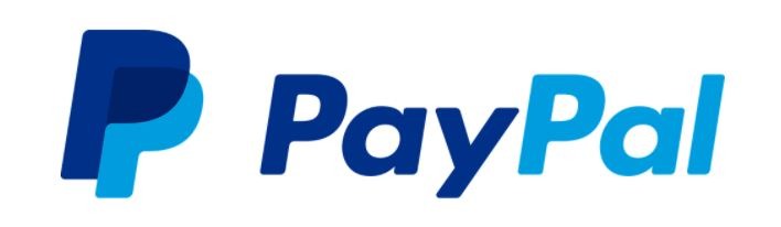
In 2014, Paypal decided to ditch their concise and clear logo for a wordmark, which was a complete mess. Whenever designing a logo requires due diligence and research to determine if it's similar to any other brand. The latest logo of Paypal resembled Pandora's logo so much that the latter company sued Paypal.
Pepsi
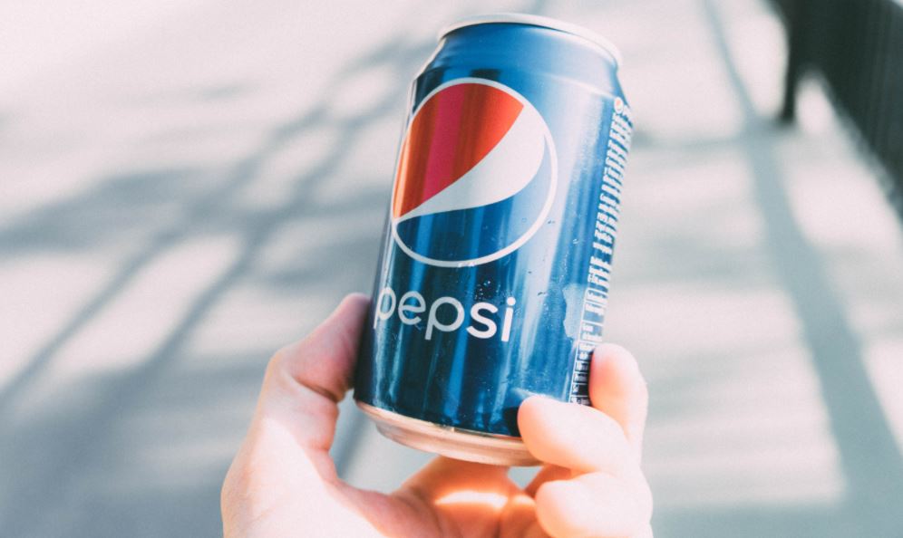
I remember growing up with the nostalgia of the Pepsi logo placed on a can or a glass bottle. When the time came, Pepsi decided to change its design with a swoosh in the middle in 2008. This was not popular at that time, and people have now accepted the newest logo of Pepsi.
American Airlines
American Airlines changed their 45 years old logo in 2013. The old logo gave a powerful and strong message through its visuals. American Airlines changed its logo for a more sleek look following the trend. The designer of the original logo was disgusted by the new look of American Airlines.
Conclusion
Logos are important because a good logo will help create the credibility of the brand/company. Whenever you're designing a logo for yourself or a company, just remember to make it clear, concise, and easy to understand. Lots of moving parts tend to reduce the effectiveness of even the simplest of logos.
Our guide on Mistakes to Avoid When Designing Logos might be helpful.