10 Tips for Designing a Perfect Logo
Branding and marketing are essential parts of any business and that is the reason why many established businesses are spending thousands of dollars to make sure they improve their identity. Branding your business means to distinguish it from others and helping it build its own recognization and reputation. There are multiple things that make the brand stand out, and one of those things is a Logo, so why not design it in a perfect way?
Either you are a designer who wants to create an iconic logo for his client or a businessman who is looking for some guidelines for designing a perfect logo, these 10 tips mentioned below won't just help you design a remarkable logo but also let you know the important things to consider before starting the designing process.
1. Start with some questions
Every business can have a different mindset regarding the design they want, some may want a simple and clean design and some may look for a fancier one. To reach to a certain design concept and understand the needs of your client, you can ask him some questions that may help you brainstorm some great ideas for the logo. Here are some questions that you can ask your client:
- What is your target market?
- What do you offer?
- How do you do it?
- What do you want your logo to convey about your brand/business?
- What makes you unique?
- What values do you deliver?
- How can you describe your business in 3 simple words?
These questions might seem quite straightforward and they certainly are, but they can help clear your mind and open up several paths for designing the best ever logo according to the requirements.
Designing a logo isn’t just about working with the design tools, designing beautiful text and creating some shapes. It’s much, much more than that. The logo by its very nature requires you to understand the company’s business, customers, products/services and its competitors. Thinking through these ideas and concepts is critical to success.
2. Get some inspiration
Getting some inspiration from other designs over the internet won't hurt you at all, there are a lot of great ideas floating around. Explore Google images, different design websites and even your previous work, so you can brainstorm more and more ideas. Also, be sure to check out OUR logo library here on bizimage.li to get ideas well!
Don’t get too caught up in someone’s design that you end up designing something very similar to it. Getting inspiration means to know what other options you have. Always remember that you aren’t just limited to inspirations from logo designs only, it is recommended that you explore icons, imagery, emblems, or whatever you think is creative enough to compliment your overall design.
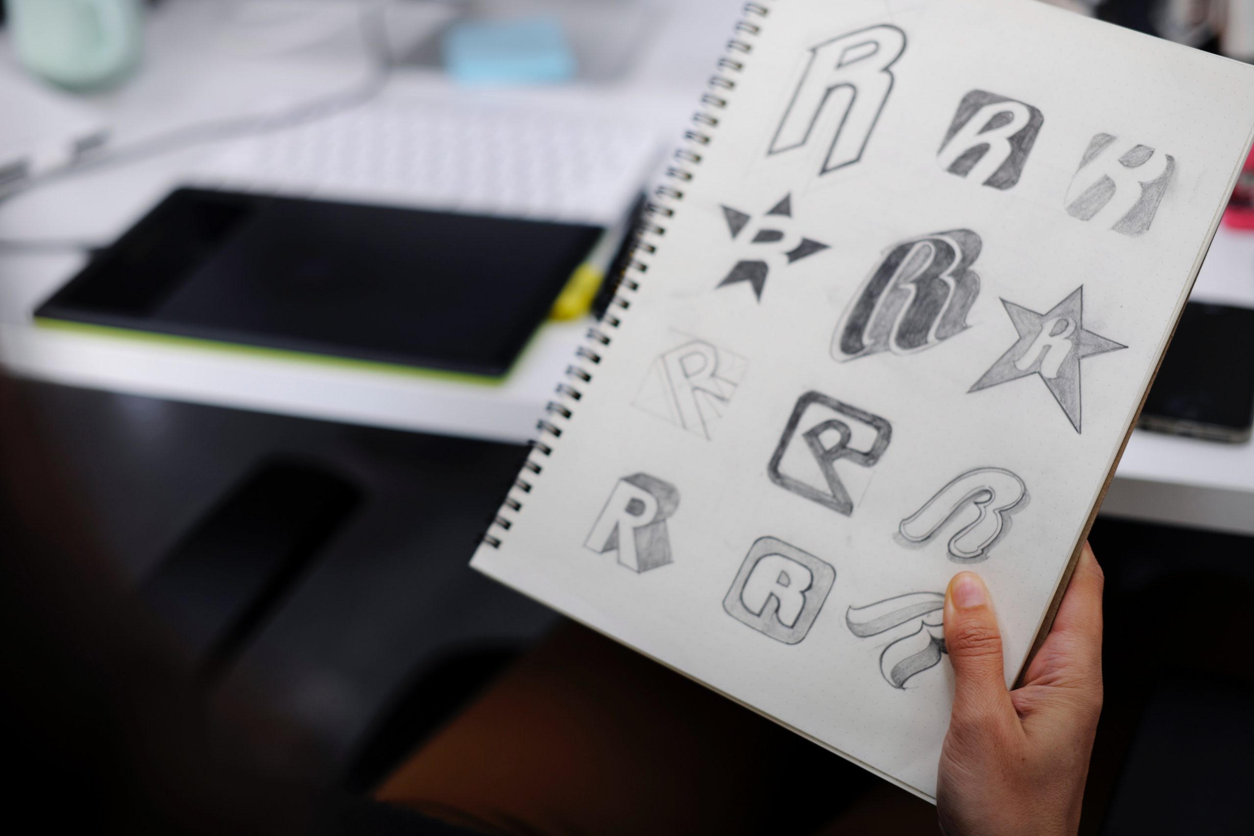
3. Picture your ideas
After asking some questions about who you are and getting the inspiration from other designs, you probably have brainstormed some ideas by now, and picturing those ideas on a sketchpad or a piece of paper to start visualizing them. Even if you aren’t the artist who will do the work, it will help to get your ideas “down on paper”. You can also use your computer to draw those ideas but using a sketchpad and a pencil can be more relaxing and more flexible rather than staring at your screen.
It doesn’t matter at all how bad your drawing capabilities are, just draw all of your ideas as fast as you can and get the essence of your ideas down. Keep a pencil and sketch pad handy while you’re working through this process, so you can capture ideas quickly. You can also digitize your drawings later and show them to others in the form of different concepts and to get feedback.
4. Make your logo easy-to-remember and recallable
This is the most important aspect of branding. How would you feel if people are able to recall what your company is just by seeing your logo design? It is recommended that you aim for simplicity because it aids recognition. Too much detailing might make your design worth a look but it will make it harder for people to remember it.
Consider the examples of renowned brands such as Nike, Adidas, Apple etc., they all could a much more detailed design but what did they choose instead? They chose to build a brand on a simple and clean mark (logo design) so people can remember them without thinking too much. You will be using your logo in many places and people will find it everywhere from your website to the signage on your building, so rather than focusing on overly detailed design, focus on delivering value through simple and easy-to-recall design.
5. Aim for versatility
Versatility in logo design means that your logo can be portrayed anywhere without being limited by aspects such as color, size, or look. If you are focusing on too many colors, then keep in mind that your logo is your brand’s identity and you won't just be using that identity on a single platform, so for example would that colorful logo look good on a shirt or a cup as good as it looks on the screen?
Being versatile can also make your logo design popular and you won't reach that level of popularity if your design looks good on websites and digital media but not so great in print. Using too many colors can make your logo look stand but might not be as versatile as needed for different uses. For example of the Apple’s logo looks good even if displayed in whatever size and color, irrespective of any limitation.
6. Choose the most appropriate typeface
As we already know that simplicity is the key to a successful logo design, so choosing the typeface and specific fonts can also enhance the overall look of your logo. Make sure you use an appropriate font family to compliment your design
Here are some fonts you should never use in your logo design and most of the designers love to hate these fonts because they are so overused in print designs.
- Comic Sans
- Arial
- Papyrus
- Bradley Hand
- Trajan
Here are some professional looking fonts that can make you a clean logo design.
- Brandon Grotesque
- Proxima Nova
- Gilroy
- Mont
- Museo Sans
- Qanelas Soft
- Fibre (for some vintage-style look)
- Andis
- Havania
- Raph Lanok
7. A clean design doesn’t mean not exploring colors
Without colors, our life would be boring and everything would look the same. Do you prefer the old black and white movies over the latest ones with so many colors in them– No, right? Same goes for a logo design too. No doubt B&W is a gem and can’t be overlooked in any logo design but you shouldn’t ignore the power of other colors as well.
If your brand is based on joy and life then using simple black and white won’t suffice. You must choose joyful colors that portray what you really are. Many designers have a notion that a “clean design” means the only color to be used is “white space” but you can also achieve a neat and clean design using 1 or 2 other colors. However, it is not recommended at all that you add so many colors and end up designing a logo that looks too messy.
Colors have the ability to affect feelings and emotions. You can choose the best one by exploring your target audience in terms of age, cultural orientations, and gender, and then adding your creativity to get a killer color palette for your logo ready! If the brand already has its chosen colors, you can use them too to make an appropriate logo.
Here are some colors and their meanings, so you can choose the one according to the requirements and brand’s business nature.
- Red: energetic, bold
- Orange: creative, friendly, youthful
- Yellow: sunny, optimism
- Green: growth, organic, instructional
- Blue: professional, medical, tranquil, trustworthy
- Black: credible, powerful, strong
- White: simple, clean, pure, decent
- Pink: fun, flirty, girlish, sweet
- Brown: rural, historical, construction
8. Use guides and take care of balance and proportion
Everything that is made with balance and proportion looks neat, clean and perfect in the eyes of the viewers. Reflection of harmony and balance is really crucial for a logo design. You should make sure whatever text and graphics you use for your logo design are easily readable even in the minimum size. Most popular tool for creating logos is Adobe Illustrator and you must use its “guides” to create the perfect logo in terms of balance.
To test your logo for perfectness and versatility, you must decrease its size from very small to very large and make sure it looks ok.
You will be using your logo in several places and if you aren’t taking care of the balance and proportion then it might look good in a single size but not the same when printed on some large area such as a billboard. Consider using golden ratio in your logo design to make it look more aesthetically pleasing to the eye; it is a mathematical ratio that is commonly found in nature and when you implement it in your logo designs, it makes organic and natural looking compositions. Do you know what Da Vinci’s Mona Lisa and the Pyramids of Giza have in common with the logos of Pepsi and Twitter? They all are designed using the Golden Ratio technique.
9. Design a logo that tells a story
A logo is capable of conveying a message and telling a story about your business to the viewers. First, you need to know what your story is and then make a logo out of it using custom shapes, graphics, and texts.
Don’t tell the whole story, as curiosity is the major factor to engage more audience and force them to think what philosophy your brand is built on. Professional designers never see a logo just as a piece of artwork that consists of some random shapes and text; instead, they go for a logo that is able to convey the value and business of the brand to the people without explaining it to them.
For instance consider the logos of the two famous companies Amazon and FedEx, their design tells the story of what they do. Amazon has an arrow pointing from a to z, which means that they have almost everything from a to z. FedEx is a multinational courier delivery services company and its logo is telling about the nature of business by an arrow which is in the negative space between the E and the X.
So, whenever you’re thinking an amazing logo, don’t just create a shallow piece of artwork without any message, rather create a design that consists of deep thinking and meticulous design, you'll see benefits in the final result.
10. Once done, use mockups to showcase your logo design
Once you are done working on the logo design, you can use mockups to showcase it so you and your team can have a realistic preview that how would it look if used in certain different places.
There are many mockups tools available on the internet and you can explore different options such as a business card, paper pad, pen, box, and a shirt mockup etc. it won't just help you have a realistic preview but also portray your hard work to your client in the best possible light.
Conclusion:
Your logo is a cornerstone of your brand so make sure it is perfect in every way and is able to portray what your business really is about. You should never rush the logo with so many things neither design it too plain that it lacks the message-conveying power. Investing some time in learning and implementing these useful tips in your designing process is much better than investing a lot of money in complete rebranding four to six years from now.