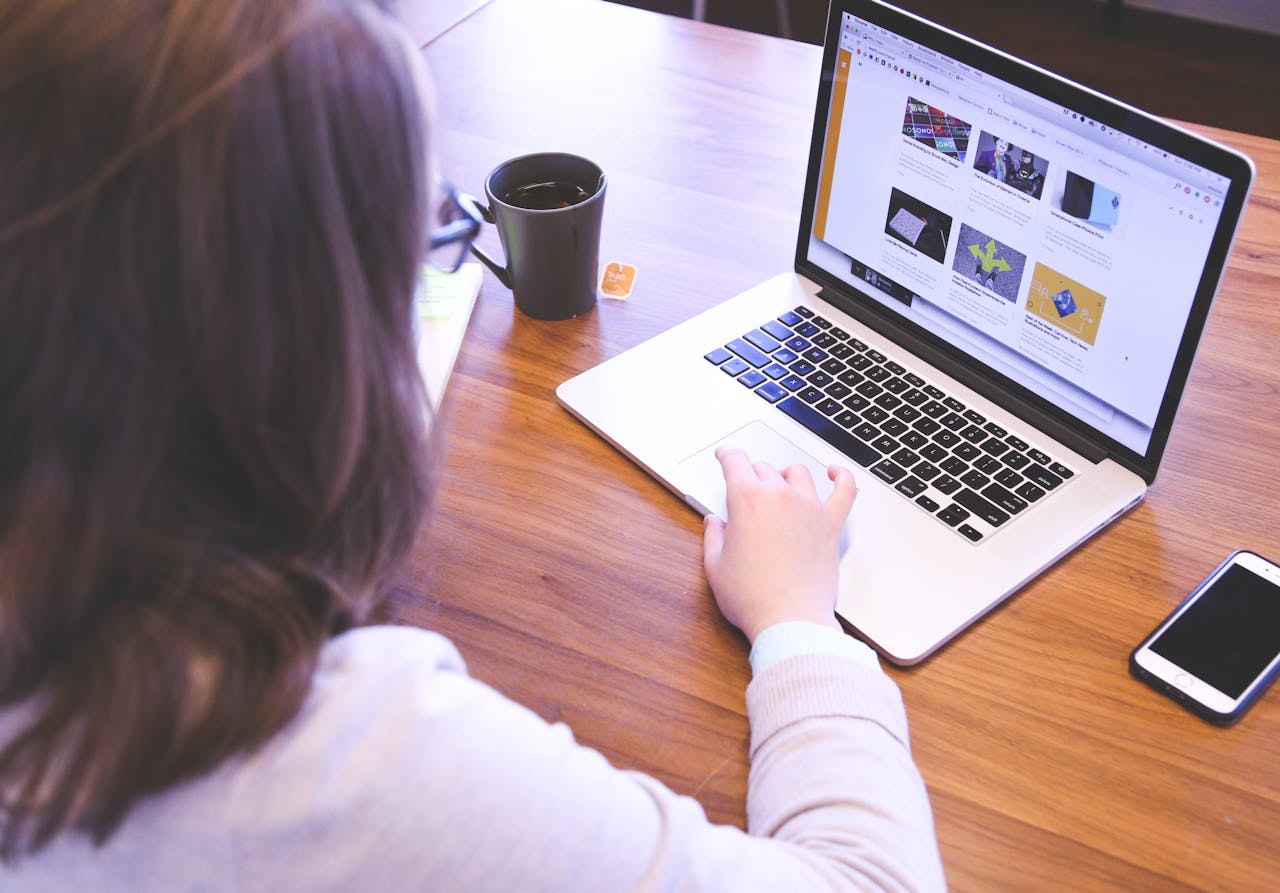
Optimizing Your Website for User Friendliness

Websites of today are so much more than text and photos on a webpage. Today’s user expects a site to be engaging, fast-loading and aesthetically pleasing. Fortunately, it is easy to deliver an overall pleasing experience to your visitors to make your website more user friendly. Here are some steps you can consider. But before we delve into the details, visit jokaroom first and see the best online casinos in Australia.
Making Your Site User-Friendly: 10 Simple Steps
1. Ask your Users
In order to make your online real estate more appealing to the visitor, why not ask the visitor what they would like to see? Getting feedback from your target audience will enable you to discover elements that you might have missed. You can take constructive feedback and turn it into positive by incorporating those changes.
2. Utilize White Space
Website owners often confuse white space with missed opportunity. However, this space can do the opposite for you. White space is a crucial element of good web design. It brings out the content more openly and gives some relaxing space for the eyes. When you put white space around the text, it also improves the readability of the text. One disadvantage of white space is that it does take up space. So it is upto you to keep a healthy balance in the mix and not push important information to other pages.
3. Speed Matters
Today’s website visitor expects a website to load at a lightning fast speed. Most users expects a site to load within 2 seconds, so that is some pressure for every website owner. Speed does matter when you want to keep a visitor on the page and not have them abandon your site. There are many online tools that help check website load speed like Google’s Page Speed Insights. The tools also give you tips on improving load speed by focusing on key areas.
4. Use Appealing Calls to Action
When a visitor lands on your page, they expect you to tell them what to do next. Users are accustomed to following instructions in order to find what they are looking for. Calls to action (CTAs) help by showing the clear instruction to a user on where to go next. CTA buttons are closely tied with color psychology as color of a button hugely impacts the decisions of your user. The second thing to consider is the words you put on the buttons, and that it where a good copywriter steps in.
5. Try Hyperlink Differentiation
Adding a hyperlink to any page means that you want the user to click on that link. Make sure that your links are easy to identify with the help of visual cues. Hyperlinks that are underlined and in other colors help the user identify that there is a link you need to click. There are many things that come into play in hyperlink differentiation. For example, if the text is long, bold and underlined, the user will easily spot and click it.
As for broken URLs and webpages not loading problems you might face, solutions exist for these two. Adding lively and fun elements to 404 pages, and other side elements will give the message that you’re trying to improve things.
6. Apply Intuitive Navigation
As soon as a visitor lands on your page, they look for a navigational heads up to browse the site. The navigation bar is important because it enables a visitor to go to different pages. Try intuitive navigation rules to make the site pages freely flow along. Make sure that you do not turn the navigation too bulky or overloaded because that can confuse the user. You will find this is case with sites such as these best online casino usa that focus on ease of use and navigation.
7. Use Photos Wisely
People are getting smarter at judging websites and whether they should browse any further or not. When someone first lands on the site, they can tell if you are using a stock photo or a customized photo from your own photoshoot. Photography also has a way of depicting your branding guidelines and it is just not the same with stock photos. Associating your business with stock photos is not an impression you want your users to make. The rule here is to either go with stock photos that are absolutely necessary and in line with your branding guidelines or hire a photographer to do the job for you.
8. One Color Scheme Works Best
Instead of using multiple colors on your webpages, go with a single color. This will promote brand consistency while making it easy for people to consume your content. Some of the most successful sites have a one color scheme, as multiple colors often leave a confusing message for visitors. That said, it’s important to pick a color that represents your business’s personality. We recommend using the color chart to learn about different colors and their meanings.
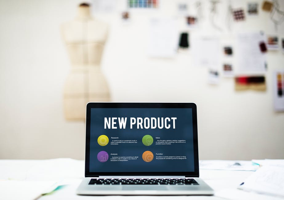
9. Directional Signage Can Improve User Experience
As part of your UX revamp, you can include directional signage to improve the visitor experience on your site. Get started by including an arrow pointing the way to the critical sections on your homepage. This could also work for an ecommerce site, where the store owner can direct visitors to new products or special offers.
Directional signage can be used in any way that makes sense for your customer journey. For instance, it can make sense to include a red arrow directing the visitor from a product tutorial to a Contact Us button. You can even add some copy to give context for the signage.
While directional elements are important, make sure to attain a balance between positive and negative space. This means highlighting crucial information and products with the use of white space. Extra negative space can also be a canvas for signage and works in scenarios where you’d like to point a visitor to a specific section.
10. Don’t Forget Content Layout
The way your content is presented also has an impact on user-friendliness. In this era, nobody is interested in reading long paragraphs, even if they’re stocked with valuable information. The texts and content on your site should be arranged for easy readability. Use bullets, comparison tables, widgets, etc. to make delight and engage your visitors.
You can also add an FAQ section featuring short answers to questions that people often ask. New visitors can go through this section instead of wondering how to get in touch with your support team. All of this combined will increase the general user-friendliness of your site.
In terms of content design, you could achieve a business-oriented or professional look with a minimalistic color scheme. Or, moving pictures and color visuals could be the order of your day. It all depends on the type of clients you’re aiming to target.
Conclusion
The steps mentioned above will make your site more user friendly, but the real key to good US design lies in constant testing and improving. Take the time to ask the user how they like their experience on the site so far and what they would like to change. Once your site becomes a hit with the users, you can get more leads and boost your sales numbers.