The complete guide to Circular diagrams
What is a circular diagram
The data values are represented as percentages of the total in the circular figure. Categories are made up of distinct divisions. The length of each section will be decided by its value. Circular diagrams are commonly used to depict percentages.
The circle figure essentially depicts the resource-money interaction that exists between enterprises and households. A circle diagram is a graphic representation of an economy's financial transactions used in economics.
The fundamental circular diagram is divided into two sections that govern revenue, investment, and output: the flow of physical objects (goods or labour) and the flow of money (what pays for physical things). A circle diagram is commonly used in a variety of presentations to explain the internal workings of a financial structure and different areas of the economy.
You can download well designed circular diagram PowerPoints and create diagrams with the least difficulty. The template can be edited easily and used with convenience.
Advantages of using a circular diagram
Circle graphs are appropriate if you work with data in whole percentages. Circle graphs are sometimes known as pie charts. Remember that the total of the numbers in your circle graphs must equal 100%. Aside from the obvious benefit of showing the total numbers for each category, circle graphs are also visually pleasing.
The advantage of a circle diagram over a linear diagram is its cyclical design of both inputs and outputs, which eliminates dead ends in sub-processes. Perhaps the simplest graphic for learning economics is the circle chart (also known as the circle model).
Circle diagram vs. Pie chart
Both of these data visualisations are used to illustrate portions of a larger picture. So, what's the distinction between the two?
Let us return to the distinction between diagrams and charts.
A chart is a graphical representation of data. Charts are sometimes based on numerical data and other times on conceptual concepts.
Diagrams are more symbolic; they illustrate relationships through the layout of visual elements. They are used to describe rather than to illustrate something.
This implies that some graphs that describe non-quantifiable information can be termed diagrams. Flowcharts, Gantt charts, and organisational charts are all examples of diagrams.
When should you not use a circular diagram template?
Circular diagrams are ineffective for displaying trends, patterns, and changes over time. The best chart types for this would be bar and line graphs.
Rather than circle diagrams, pie charts or donut charts can be used to describe pieces of the whole with numerical data.
Types of Circular diagrams
Onion diagram
An onion diagram is a sort of graphic that depicts the interdependence of various parts of an entity or function. Objects are displayed in concentric circles, with objects in each ring depending on items in the lower rings.
The onion diagram can depict the layers of a whole construction. Each circle can indicate a component that is dependent on the interior element shown by the circle within it.
The diagram's main definition is represented by the middle circle. The chart is chosen because it has a basic, easy-to-read graphic depiction that has a strong visual impact.
Cyclic Arrow Diagram
Many processes and developments have cyclic characteristics. We are pleased to give a cycle process arrow diagram and keynote to convey the cyclic process of business and marketing analysis. The graphical depiction of the arrow technique can take various forms, and this design is rather clever. The arrow pattern delineates one action leads to another in this circular process, influencing each step.
Circular hemisphere diagram
The flat graphic design of creative illustrations hemispheric diagram can be utilised to present any professional-looking material. This simple style can include corporate plans, strategy, financial reports, agenda, objectives, business processes, and any data or information. Reduced objects and garbage in concepts allow consumers to pay greater attention to the content. This makes the presentation more successful in giving maximum information while also offering an overview of the subject for the audience to look at if they wish. It is possible to illustrate new company concepts and the path to success.
Venn diagram
The Venn diagram displays an endless number of objects and their logical relationships. Using the Venn diagram PowerPoint, either corporate or academic users can demonstrate their notions and surrounding aspects. The template is made out of looping circles that are color-coded to make it easy to extract the presentation topic. It is also a comparison chart that shows the similarities between two or more sets. The Venn diagram can be used by teachers to demonstrate the link between two or more different elements.
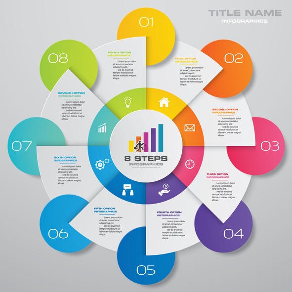
Cyclical Process diagram
The circular PowerPoint template displays the elements in a recurrent sequence, implying that the company improvement process is never-ending. As a result, it is ideal for portraying the ongoing evolution of business procedures. The speakers can use the peripheral circles to link to the centre circle. This circle ppt template can thus demonstrate the mutual relationship between the core subject and the sub-elements. This core connects these six pieces at a single place. A wheel diagram is frequently used to depict the hub and spoke connection. A business process management template can be used to demonstrate a business process's quality improvement, service upgrades, cost reductions, risk control, and increases in productivity.
Author bio: Alex Roy is a content writer, who is passionate about marketing and business. He also loves to write poetry and short essays. You can find him hitchhiking through the countryside when he is not working
Related posts